A home color analysis test is most useful when it answers a small wardrobe question: which of two colors would you rather wear near your face? Trying to name a season immediately can turn a simple comparison into an argument with a mirror. Start with consistent light, a few fabrics you already own, and notes about what you actually see. Personal color analysis offers a way to organize preferences and visual effects; its seasonal categories are styling interpretations, so a useful result can be a short list of colors without a firm label.
Find a spot where the light stays reasonably steady
Face a window with indirect daylight, with the mirror between you and the window if the space allows. Direct sun can create bright patches and hard shadows that distract from a fabric comparison. Turn off nearby lamps so warm indoor light does not mix with cooler window light. A plain gray, white, or softly neutral wall makes a calmer background than a red curtain or a green shelving unit.
Look around before settling in. A brightly colored wall beside the window, a vivid sofa, or a large colored shirt can affect the light reflected toward your face. You do not need a studio or a supposedly perfect north-facing window. You need a repeatable position where your face looks evenly lit and where you can finish a short comparison before the conditions change.
Wear little or no visible makeup if the goal is to compare colors against your natural appearance. Alternatively, test your everyday makeup look and record that choice. Neither setup is a moral achievement; they answer slightly different styling questions. Pull strongly colored or dyed hair back if it keeps pulling your attention away from the face, then repeat your favorites with your hair visible.
Choose pairs that test one question at a time
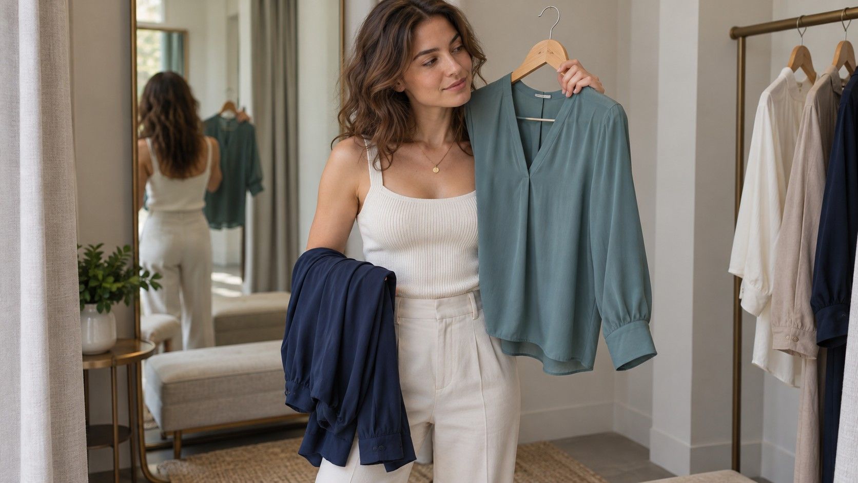
Gather six to ten tops, scarves, or pieces of fabric rather than emptying the wardrobe. The material should be large enough to cover the chest under the chin. Keep its position similar each time, and avoid bringing it over your lower face. Shiny satin and a heavy knitted scarf can reflect light differently, so comparable textures make the first round easier to read.
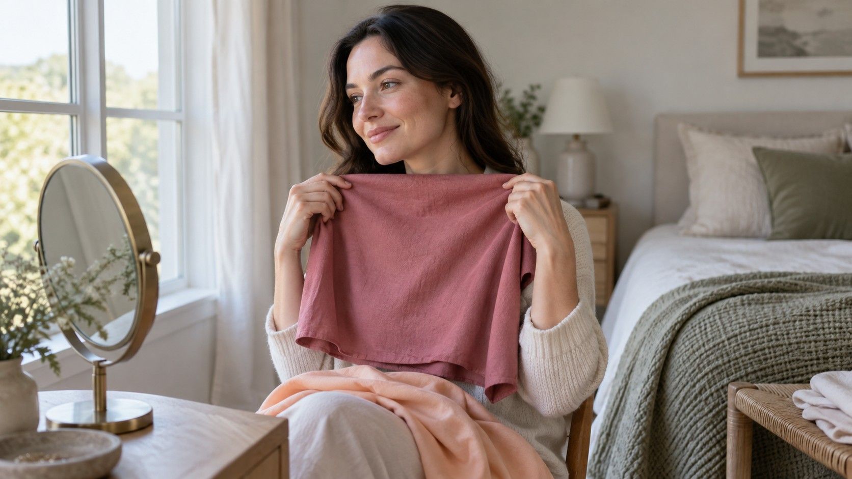
A peach and a cool rose can help explore a warmer-versus-cooler preference, provided they have reasonably similar lightness and strength. Pale peach against deep burgundy changes several things together. If the burgundy wins, you cannot tell whether the appeal comes from temperature, depth, saturation, or simply your preference for burgundy.
| Question | A workable comparison | What to keep similar |
|---|---|---|
| Warmer or cooler? | Peach beside cool rose | Lightness, intensity, fabric finish |
| Lighter or deeper? | Light blue beside navy | Color family and fabric finish |
| Softer or clearer? | Dusty teal beside a clearer teal | Approximate lightness and temperature |
| Which everyday neutral? | Two grays, creams, or browns you own | How much fabric sits near the face |
These are practical approximations, not controlled measurements. Use what you have and name the limitation. A warm brown and a black jacket can still be worth comparing when choosing a coat, but that pair alone cannot establish your undertone. An honest wardrobe decision is more helpful than a precise-sounding conclusion built from mismatched samples.
Watch the face before deciding whether you love the fabric
Hold the first fabric under your chin for a few seconds, then replace it with the second. Keep your shoulders, mirror position, and distance from the window steady. Look at the whole face before studying individual features. Does one color seem to leave the face clearer? Does the other become the first thing you notice? Is there a reflected color along the chin that you find distracting?
Terms such as brighter, balanced, and harmonious describe a viewer's impression. They are not readings of skin health or objective measures of attractiveness. Shadows already present around the eyes may look more obvious beside one fabric, but lighting, expression, and tiredness can also change that impression. Avoid treating every shadow as evidence that a color is wrong.
Reverse the order: second fabric first, then the original. If possible, ask someone to swap them while you watch your face, without telling you which seasonal category each fabric supposedly belongs to. That small change can reduce the urge to defend a favorite label. If the difference vanishes on the second pass, record a tie. You do not owe every pair a winner.
Separate depth and softness from the warm-or-cool question
Undertone often gets all the attention, yet a very pale color and a deep one can create quite different outfits even within the same temperature family. Once you have tried a few warmer and cooler pairs, compare light and deep versions of a familiar color. Note whether you prefer the gentle effect of light blue or the stronger frame made by navy, rather than assuming the deeper shade must be better.
Next, compare a muted color with a clearer one. Dusty teal has a different visual presence from a more saturated teal. Try to keep their lightness close enough that the test is about softness rather than darkness. If your available fabrics differ a great deal, describe the observation narrowly: you preferred this particular teal top, in this light, over that other top.
Different results across these dimensions are normal. You might prefer cooler colors but find very icy shades difficult to style, or enjoy soft warm shades while disliking dark brown. Seasonal palettes can later provide a vocabulary for these combinations. They do not require you to ignore an observation because an online diagram says the combination should not occur.
Write a record you can check another day
For each pair, write the names of the actual garments and one short observation. “Blue cotton shirt: face stays the focus; mustard scarf: prefer it farther from the chin” is more useful than “definitely summer.” Also record the time of day, room, makeup, and whether your hair was covered. You can then repeat the strongest comparisons without rebuilding the experiment from memory.
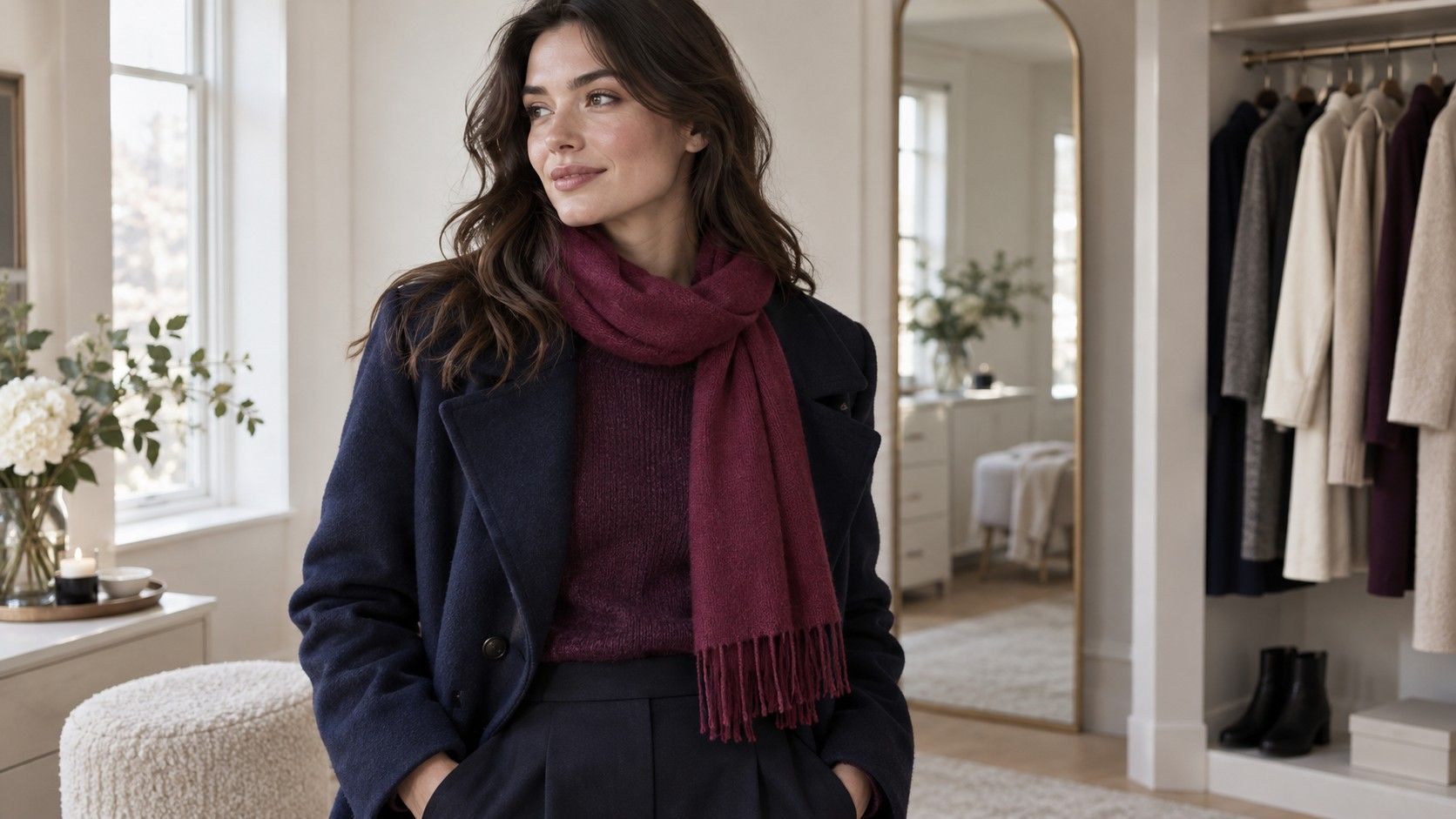
Keep three groups: preferred near the face, uncertain, and useful elsewhere. That last group matters. A color you dislike directly under your chin may work beautifully as trousers, a skirt, shoes, or a bag. Color analysis does not need to become a reason to discard serviceable clothes. Distance from the face changes the styling question.
Repeat a few pairs on another day in similar light. If the preference remains clear, it earns a place in your working palette. If it reverses, check whether the light, makeup, fabric position, or expectations changed. You can leave the result unresolved. A home test has done useful work when it narrows a choice, even if it leaves you between seasonal categories.
Use your findings for one small shopping decision
Choose a modest next step: a T-shirt, scarf, or replacement knit in one of your repeat favorites. Take a familiar garment along if that helps you compare shades. Store lighting can be very different from your window setup, and a color name on a label tells you little about the actual shade. Look at the item near your face and, where possible, check it again in daylight before removing return tags.
Consider the rest of the outfit too. A flattering-looking green that fits none of your trousers may get less wear than a slightly less compelling blue that works with everything. Texture, neckline, comfort, and the colors you enjoy all belong in the decision. A palette is a practical editing tool, not a uniform or a verdict on your taste.
After wearing the purchase, ask whether it made getting dressed easier. That is a better final check than collecting more seasonal labels. Keep the home color analysis test small enough to repeat, keep uncertain findings provisional, and let actual clothes provide feedback. Over time, a handful of dependable shades can do more for your wardrobe than a perfect-looking chart you never use.