A useful color analysis test photo shows your appearance consistently enough for a comparison. It does not need to be your most flattering portrait. Warm lamps, a bright filter, or a vivid wall can make the same person look quite different between pictures, which makes an online result difficult to interpret. Before uploading a selfie, take a few minutes to control the light and framing, then check whether a repeat photograph looks similar. Online color analysis can suggest styling directions, but a photo does not establish a scientifically definitive seasonal type.
Choose the light before choosing the camera angle
Stand or sit facing a window in indirect daylight. The aim is an evenly lit face with enough detail to see its appearance clearly. Direct sunlight can leave one cheek washed out and the other in shadow. A window at your side can produce a dramatic portrait, but that uneven light makes it harder to compare the two sides of the face.
Turn off lamps near the window. Mixing daylight with a warm ceiling light can leave different areas of the image with different color casts. Also check what sits around you: a red curtain, green wall, or brightly colored awning outside may affect the light reaching your face. Moving a short distance or choosing another window can help more than changing camera settings.
Take the photos within a short period while the light is steady. If clouds are moving quickly and the room keeps brightening and darkening, pause until the conditions settle. There is no universal hour that suits every home. Record the window and approximate time so that you can reproduce the setup if a service requests another image.
Keep the phone from making each picture look different
Clean the lens and use the ordinary camera mode first. Turn off visible beauty filters, face reshaping, portrait effects, and optional color styles where the phone allows it. Avoid a social media camera that adds an effect before saving. A picture can look natural at a glance while still containing processing, so check the camera settings rather than relying on the preview alone.
Automatic exposure and white balance may change when you move, lift a different garment, or include more of a bright window. If your phone offers a simple exposure lock, it may help keep a series steadier. Do not assume that locking focus also locks every color setting; implementations vary. Follow the instructions for your device and keep the framing unchanged.
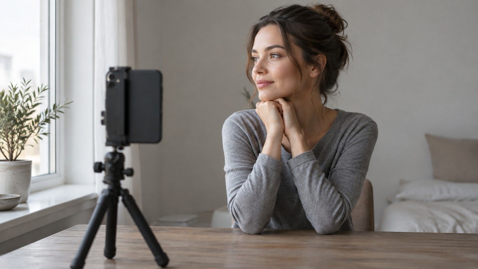
Use a timer or a stable support to avoid repeatedly moving the phone. Place the camera around eye level at a comfortable distance, with your whole face visible. A close, steeply angled selfie can change how facial features appear and make comparisons awkward. You do not need a new camera. A steady, ordinary photograph is a more useful starting point than an elaborate portrait setup with unfamiliar controls.
Make hair, clothing, and background deliberate choices
Choose a plain, unobtrusive background and a neutral-looking top that does not dominate the frame. Avoid strong patterns or a large colored collar close to the chin. Bright fabric can reflect color toward the lower face, and it can also influence the camera's automatic adjustments. Keep accessories that cover the face or cast obvious shadows out of the image.
Follow the receiving service's instructions about makeup and hair. For a view of your natural coloring, little or no visible makeup is usually the clearer reference. Foundation, bronzer, blush, and tinted lip products change the appearance being judged. If you normally wear makeup and want advice for that look, explain that context rather than presenting the picture as a bare-face reference.
Dyed hair deserves a note because its current color may strongly shape a styling impression. Pull it back for a reference image if requested, then supply a second image with it visible when the service accepts one. Avoid guessing your season from hair color or ethnicity. Neither provides a reliable shortcut to the subjective comparisons involved in seasonal styling.
| Before the photo | Practical check | Why it matters |
|---|---|---|
| Light | Face the window; switch off nearby lamps | Reduces mixed casts and uneven shadows |
| Camera | Check filters and optional beauty settings | Keeps deliberate effects out of the reference |
| Clothes | Keep a vivid collar away from the chin | Limits distracting reflected color |
| Framing | Use the same position for repeat images | Makes changes easier to notice |
| File | Keep the original saved photograph | Avoids unnecessary edits and screenshot changes |
Check two repeat photos before trusting either one
Take one photo, wait a moment, and take another without deliberately changing anything. Open both saved files and compare them on the same screen. Does the whole image shift warmer or cooler? Does the forehead become much brighter? Is one cheek suddenly darker? A visible change between these reference images is a reason to check the setup before submitting a larger batch.
Look beyond the face. If a neutral-looking wall also turns warmer in the second photo, the change may involve the light or camera processing rather than your appearance. A white or gray object in the frame can give you a rough visual reference, but an ordinary household object is not a calibrated color target. It cannot guarantee accurate reproduction.
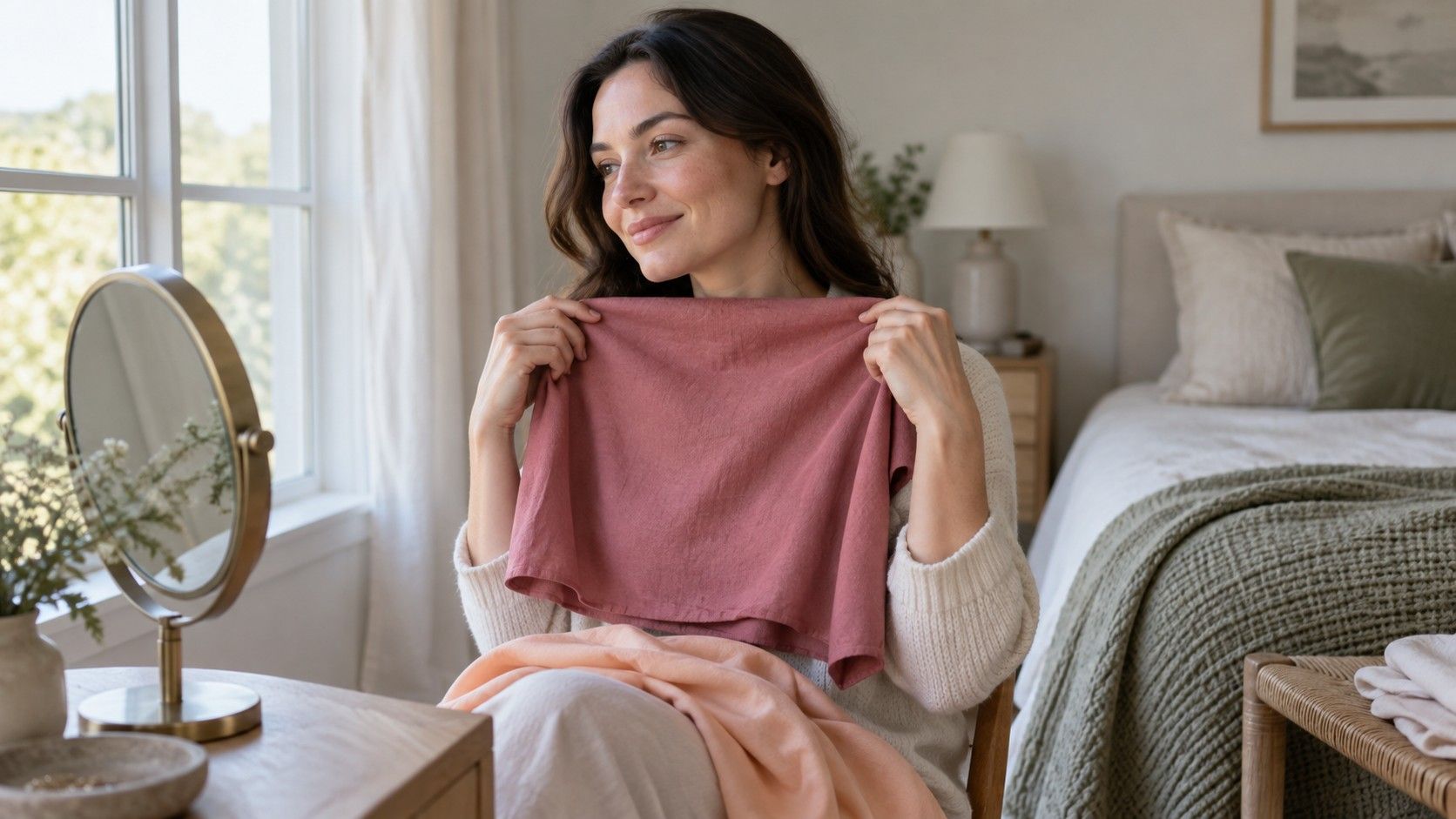
For fabric comparisons, keep the camera and your face in place while changing the material under the chin. Start with a small number of pairs. If every new fabric causes the camera to brighten or recolor the scene, those images may be poor evidence for fine distinctions. Comparing the actual fabrics in the mirror can then be more useful than collecting dozens of unstable photographs.
Send a clear file and enough context to interpret it
Use the original saved image when the upload process permits it. Avoid screenshots of a photo displayed inside another app, collages, heavy crops, and files edited with warmth or saturation adjustments. A tighter crop may be requested for privacy or framing; follow the stated requirements, while retaining an untouched original for your own comparison.
Check the actual service's accepted file size, format, and framing rules before uploading. Requirements differ, so there is little value in a universal instruction to export one particular format. Also check what the service says about image storage and deletion. A face photograph is personal material, and you should be comfortable with the destination before sending it.
Add concise context if there is a place for notes: indirect window light, no filter selected, whether makeup is present, and whether the hair is dyed. Mention obvious uncertainty such as a room with a colored wall or a phone that applies processing you cannot disable. These details give the recipient a fairer basis for judging how much confidence to place in the image.
Treat the result as a palette to try in real clothes
Even a carefully prepared photograph passes through a camera, software, a file, and a display. The person or tool assessing it sees that representation rather than your face beside real fabrics. Differences between screens and automated processing can matter, particularly when the proposed distinction is subtle. Preparation reduces avoidable problems; it does not remove every source of uncertainty.
If two online color analysis services give different seasons, first compare the input photos and the descriptions behind the labels. One may emphasize softness while another emphasizes temperature. Seasonal systems also use different categories. A disagreement does not require you to choose a new identity or keep uploading selfies until one label feels convincing.
Take the suggested colors to a simple wardrobe test. Compare a few with familiar tops in steady daylight, then consider whether you enjoy wearing them with your usual hair and makeup. Keep shades that work for your clothes and taste, and leave uncertain recommendations open. The practical value of color analysis online is a manageable set of options to explore, with room for your own judgment once the camera is put away.