A color can look excellent on a hanger and still be awkward to wear with anything at home. A practical color test for clothes needs to answer two questions: do you like the color near your face, and does this particular garment work in your wardrobe? The fitting room helps with both, provided you compare fairly and look beyond the first flattering impression. Begin with a familiar item, check the actual fabric and neckline, and leave room for a daylight check before making the purchase permanent.
Bring a familiar color into the fitting room
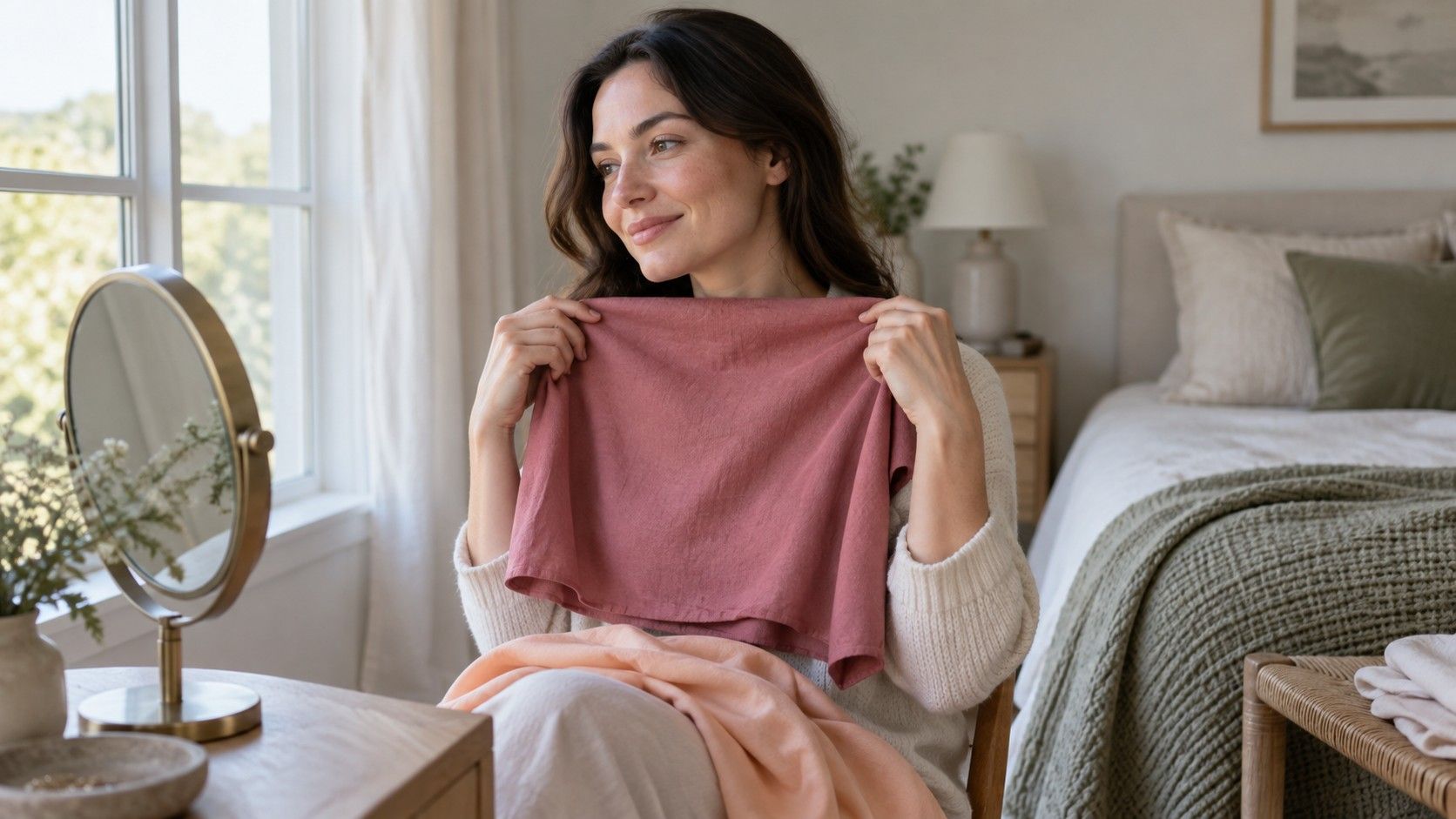
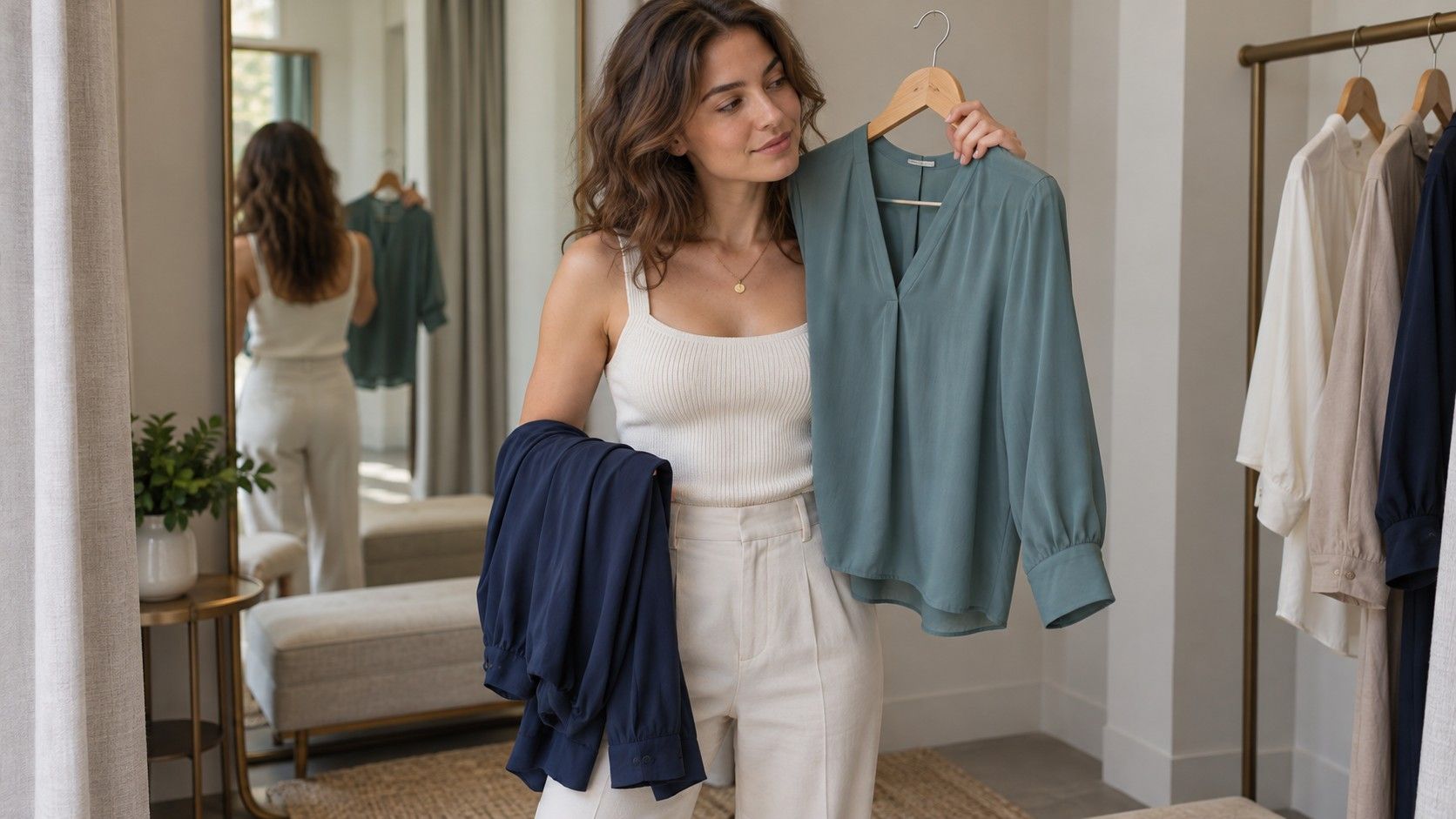
Wear or carry a top you already enjoy. It gives you a reference when an unfamiliar shade starts looking appealing under shop lighting. Try the candidate beside that reference in the same mirror position. Keep your distance from the mirror similar, and avoid turning toward a different light each time. You are trying to compare clothes, not two lighting setups.
If the same style comes in several colors, start there. The cut, fabric, and amount of material near the face stay reasonably consistent. A navy crew-neck T-shirt against an orange satin blouse changes too many features to isolate a color preference. You can still choose between those garments, but the winning outfit does not tell you that navy always beats orange.
Give yourself a small set of options. Three or four plausible shades usually make a more manageable comparison than an armful of every available color. Set aside anything that already fails on fit or comfort unless you are specifically using it as a swatch. There is little value in deciding that a shade is perfect on a garment you would never choose to wear.
Watch what happens near the neckline
Put the garment on when possible. Holding it against your chest can help narrow a choice, but the real neckline changes how much color appears close to your face. A high-neck knit creates a broad field directly under the chin. A deep V-neck or open shirt leaves more visible space and may make the same shade feel easier to wear.
Look at the whole impression first. Does your face remain the focus? Does the color give a contrast you enjoy, or keep drawing your eye away from everything else? These are judgments about styling, so a strong-looking color is not automatically a failure. A vivid shirt may be exactly what you want from a simple outfit with plain trousers.
Then inspect the garment from the side and while moving. Glossy fabric may reflect a noticeable cast onto the lower face at one angle. A matte version of the same named color can look much quieter. If a shade feels too dominant, try a lower neckline, an open layer, or a smaller area before writing it off as a color you cannot wear.
Build the decision around useful neutrals
Compare the neutral shades you actually buy. Black, navy, charcoal, brown, cream, and white each cover a wide range of real fabrics and finishes. A nearly black navy and a washed denim blue are very different wardrobe ingredients even though both may be described as blue. Use the garments in front of you instead of assuming the color name guarantees a familiar effect.
A new neutral should connect with existing clothes. If most of your trousers are navy and gray, check whether a brown jacket creates combinations you want to wear. If your favorite knitwear is cream, compare it with the proposed coat rather than judging the coat in isolation. Bring a small existing item if carrying a full outfit is impractical.
A personal color chart for clothes can help you remember the directions you enjoy, but it should leave room for variation. Fabric weight, texture, and wear all change the appearance of a shade. Treat a digital palette as a reminder to look at certain colors, not a demand to match a tiny square exactly. Two slightly different blues may combine well without either being the chart's official blue.
Choose accent colors by what they will join
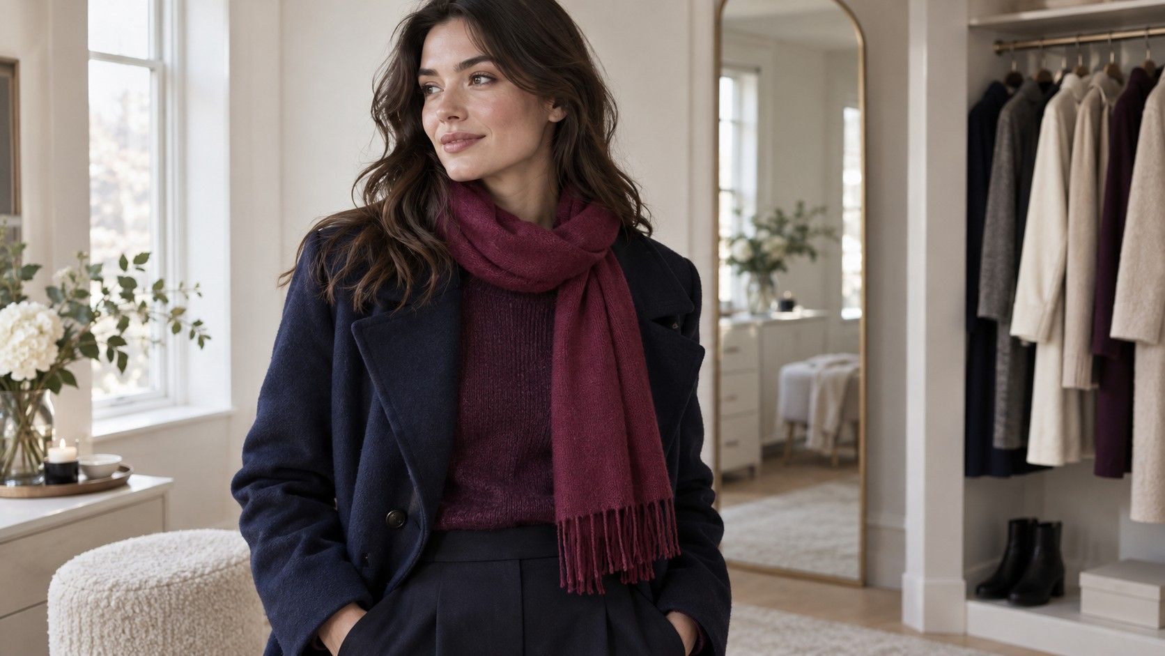
Once the neutrals make sense, add an accent with a job to do. Perhaps you want a green top to wear with two existing trousers, or a red scarf to brighten a dark coat. Name those combinations while you are still considering the purchase. An attractive shade that requires several additional purchases may be a different project from the simple wardrobe update you intended.
Try the accent with one quiet outfit before adding more color. You can then see whether you like its depth and intensity without a competing print. If you enjoy colorful combinations, build them gradually: a soft pink knit with burgundy trousers, or blue with green, may be more interesting to you than matching every shade to the same seasonal palette.
Personal color analysis can suggest useful directions, but seasonal categories do not decide whether a combination suits your taste or circumstances. You might prefer an understated top for work and a striking one for evenings. A useful color guide for clothes should support both. There is no need for every purchase to create the same visual effect.
Use the return period for a proper daylight check
Read the return conditions before buying, particularly for sale items and online orders. Keep labels attached and preserve the garment's condition while assessing it within the retailer's rules. At home, face a window in indirect daylight and compare the new piece with the reference you used in the shop. Turn off nearby lamps so mixed light does not muddy the comparison.
Try complete outfits with shoes and an outer layer if those are part of how you will wear it. Check the color next to your usual makeup, hair, and accessories. A shirt that looked slightly stark by itself may be exactly right under a jacket; another may disappear under a coat in a way you find disappointing. The complete outfit is the product of the purchase.
For online shopping, expect the photographed shade to be an approximation. Screen settings, studio lighting, and image processing can affect its appearance. Do not try to repair disappointment by comparing it with more screens. Judge the delivered garment in your own conditions and against the seller's description, then make the return decision while the permitted window remains open.
Keep combinations you can repeat on an ordinary morning
Before keeping the item, assemble two or three outfits you would genuinely choose. They do not have to be elaborate: the new knit with jeans and boots, with tailored trousers, and under a familiar coat may be enough. If every combination feels forced, ask whether you love the color in principle more than you want to wear the garment.
Save a simple photograph or a short note about successful pairings. A note such as “soft green top, charcoal trousers, brown shoes” is enough to prevent the item becoming isolated at the back of a drawer. A photograph works as a dressing reminder even if its colors are not perfectly accurate. You are recording a combination you have already checked in person.
Also notice why an older purchase failed. Was the color difficult, or was the neckline too high, the fabric too shiny, or the fit irritating? These distinctions stop you from rejecting an entire color family for the wrong reason. They also make the next shopping trip more focused: you can look for the same shade in a finish or shape that fits your habits.
Make the final decision with the cost and likely use in view. An excellent special-occasion color may deserve a place even if it does not match every everyday item. A basic top should probably earn its keep through easy combinations. The test has worked when you understand how and when you will wear the piece, rather than simply feeling that it belongs somewhere on a palette.