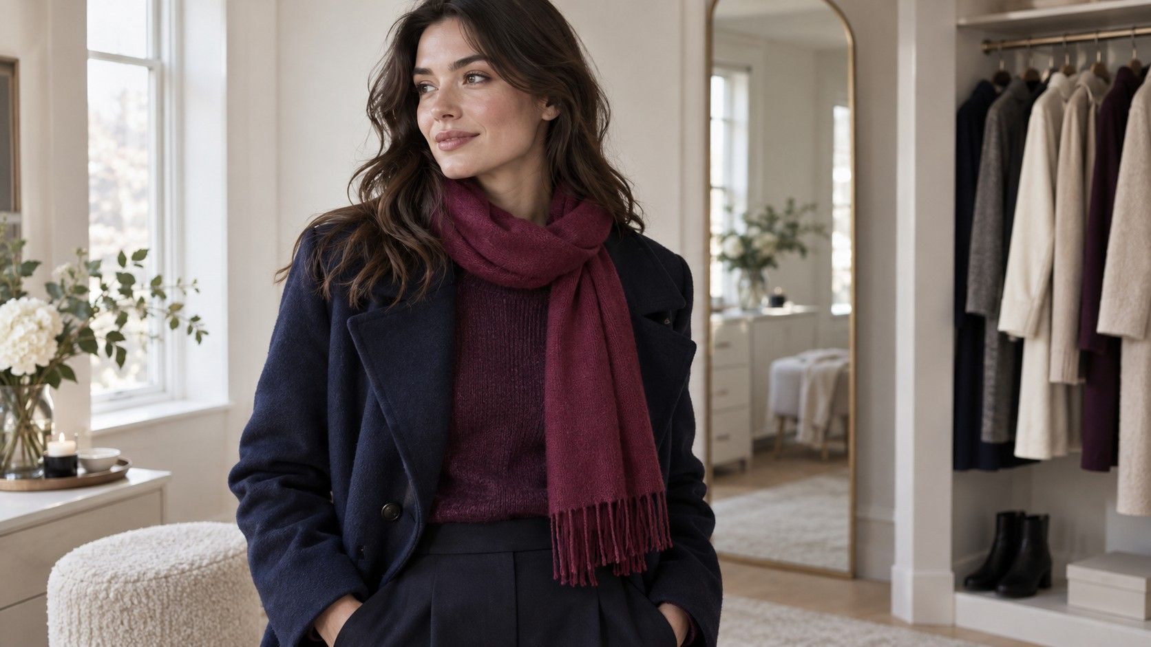
Black may be the easiest part of a Deep Winter wardrobe, which is exactly how a useful palette can turn into a very repetitive rail of clothes. Dark navy, plum, charcoal, and carefully chosen accents can give the same sense of depth with more variety. The sensible starting point is to test those colors in actual outfits, using the seasonal label as a working guide.
When dark colors seem right but black does all the work
In many twelve-season systems, Deep Winter describes a palette with substantial depth, a generally cool direction, and enough clarity to keep dark colors from looking dusty. Dark Winter is another common name. The boundaries vary between systems, so use those words to find comparison colors rather than treating them as a standardized measurement. A palette card cannot promise that every dark shade will suit every person using the label.
Start by checking whether depth is actually useful near your face. Compare a medium navy with a deep navy in similar fabric, then try a medium berry beside a dark berry. If the deeper options repeatedly give the face a clearer presence, that is a useful observation. If every near-black cloth seems heavy, pause before building a wardrobe around the category. A preference for cool color does not automatically imply a preference for maximum darkness.
Keep the test ordinary: indirect window light, the same mirror, and no change of position between fabrics. Look at the face rather than the drama of the cloth. A dark top may feel elegant because you like its mood while still making the eye area appear more shadowed. Both reactions are legitimate, but they answer different questions. Record whether you like the color and whether it makes an easy frame for the face.
When you want a dark neutral that is easier than black
Deep navy, charcoal, cool dark brown, and a near-black plum give an outfit different starting points. Compare the actual garments together in daylight. A navy may have a green cast, a charcoal may lean brown, and a dark brown may look distinctly orange beside a cooler alternative. Names such as espresso and midnight do not specify enough to make an online order reliable.
Try a deep navy sweater with trousers you already own before buying a matching set. It can pair with charcoal, denim, or a lighter cool neutral without needing every piece to be nearly black. For a dark brown, look at the overall impression beside burgundy or a cool rose: does the combination feel coherent to you, or does the brown pull the outfit strongly warmer? This is a wardrobe decision, not a purity test.
| Starting neutral | A color to compare beside it | Practical use |
|---|---|---|
| Deep navy | Cool berry or soft white | An everyday base with a visible alternative to black |
| Charcoal | Blue-red or a clear blue | A dark frame that can soften an all-black combination |
| Cool dark brown | Plum or a cool pink | A warmer-looking material without a strongly orange cast |
| Near-black plum | Light gray or a smaller berry detail | A dark color that reads more clearly in daylight |
Texture changes the result. A washed charcoal cotton reflects light differently from a smooth black wool, while dark velvet can look deeper still. If a color works in one garment and disappoints in another, compare surface and fit before rejecting the entire family. A large collar placed directly under the chin also behaves differently from a lower neckline.
When bright accents make the outfit feel too loud
A deep winter color palette is often shown with clear reds, vivid pinks, and strong blues. You do not have to wear these as a full top. Begin with a berry scarf, a blue bag, or a small area of color in a patterned shirt. A narrow accent changes the balance less than a large sweater, and it is easier to compare with a dark neutral you already trust.
Choose one accent and vary its amount. Place a clear pink scarf over navy, then fold it so that less pink is visible. If the smaller amount feels more comfortable, you may prefer restrained contrast rather than a different pink. For a red top, compare an open dark jacket with wearing the red alone. The jacket creates a dark frame and changes how much color reaches the face.
Distinguish clarity from fluorescent intensity. A clean berry can look clear without looking electric, and a deep teal can feel rich without being the brightest cloth in the room. If a vivid cobalt overwhelms, compare a somewhat deeper blue before moving straight to dusty pastel. Useful colors often sit between the extreme versions printed on a palette graphic.
Personal taste has a place here. Someone who prefers quiet outfits can use an ink-blue and plum combination with little obvious brightness. Someone who enjoys stronger color may choose a red shirt under charcoal. The seasonal category supplies candidates; it does not dictate how noticeable you should look at work or how much color belongs in your wardrobe.
When the individual colors work but the full outfit does not
A dark top can look balanced in the mirror, then feel disconnected from pale trousers and bright white shoes. The issue may be distribution. Check the outfit from a few steps away, where you can see the large blocks of light and dark. Move one dark or light detail so it repeats elsewhere, or change one large area before replacing every piece.
For a quieter combination, try dark navy with charcoal and use a small silver-colored detail or a lighter collar. For stronger contrast, compare a soft white shirt under a dark jacket. The amount of white is adjustable: an open neckline, a small visible cuff, or a larger shirt front each changes the effect. There is no requirement to use stark black and optic white together simply because the palette includes both.
Prints need the same distance check. A floral with a dark background and small cool-colored details may read mostly dark across a room, while a check with equal white and black squares reads much brighter. Look at the overall distribution rather than counting approved colors. The size of the print, neckline, and fabric sheen can matter as much as the swatches.
Photographs can help with proportion if you keep the camera and lighting fixed, but they are less dependable for exact color. Automatic exposure may lighten a dark outfit or darken the face next to a white shirt. Compare what you see in the mirror as well. Use a picture to notice a large white block at the ankles, not to prove a subtle temperature difference.
When a favorite color belongs to a neighboring palette
Keep it long enough to compare it properly. A dark olive jacket, a warmer burgundy, or a muted blue may still work with your existing clothes, particularly away from the face. Deep Autumn and other neighboring palette labels can suggest alternatives, but their overlap depends on the system. A color does not become unwearable because a chart placed it in a different rectangle.
Try the garment with a familiar top beneath it. If a warm coat feels less comfortable fully buttoned, an open collar and a reliable scarf may solve the practical issue. If a pale sweater is useful and you enjoy it, compare a dark necklace, jacket, or different neckline before deciding it must leave. Sometimes the better decision is simply to wear a favorite color and accept a different effect.
Build evidence with a few purchases rather than a complete replacement. Choose two dark neutrals, one lighter option, and two accents from clothes you already own. Wear their combinations during an ordinary week, including your normal coat and shoes. Record the pairings that are easy to repeat. A small set of successful outfits is more useful than a drawer full of exact-looking swatches.
When shopping, carry a fabric reference or your most reliable scarf. Check a candidate beside it near a window and consider the return conditions if lighting is poor. Keep notes specific: deep navy easier than black; berry good in small amounts; charcoal needs a lighter collar. Those decisions create a wearable interpretation of Deep Winter, with enough room for taste, texture, and the clothes you already have.