A cream shirt under a black jacket creates a different impression from a charcoal shirt under the same jacket, even though the garments barely change. That difference is outfit contrast: how far apart their light and dark values appear. Comparing it with the contrast in your face can suggest combinations to try. You do not need to score your features precisely or settle on a season first. A few controlled changes at the neckline usually tell you more about what you enjoy wearing than a complicated numerical face test.
Compare relative light and dark features
Look in a mirror in indirect daylight, with your hair arranged as you normally wear it. Notice the difference between the lightest and darkest visible areas: skin, eyebrows, hair, and eyes. Think in relationships. Deep hair against much lighter skin creates a larger light-dark separation than hair and skin that appear close in value. Neither observation establishes which colors you must wear, and skin depth by itself does not describe face contrast.
Eye color can be distracting because a clear green or blue catches attention even when its light-dark value is moderate. Eyebrow shape and density also affect definition around the eyes. Step back from the mirror rather than inspecting individual hairs. The aim is to see the overall arrangement that clothing will sit beside. A photograph cropped to the eyes answers a different question from a view that includes hair, neck, and the top of a shirt.
Keep high, medium, and low as rough working descriptions. If you sit between two, write that down instead of forcing a choice. Some faces have a noticeable hair-to-skin difference but softer eyebrows, while others have strong definition close to the eyes. Both may look convincing in more than one level of outfit contrast. The phrase “high contrast vs low contrast face” describes a useful comparison, rather than two boxes everyone must fit.
Use a grayscale photo to check your first impression
A grayscale copy of a clear photograph can make light-dark relationships easier to see because it removes much of the distraction of hue. Choose a picture in soft daylight without deep shadows falling across one side of your face. Include the hair you actually show around your face. Turn off beauty filters and avoid a dramatic portrait preset, which can deepen shadows or brighten skin before you begin.
Make one grayscale copy using a plain conversion, then compare it with the original. Do not keep adjusting contrast sliders until the picture matches a category. Different conversions can render colored areas differently, so a grayscale image remains a guide. A camera's exposure and processing may exaggerate the apparent gap between features. Check whether the same broad relationship is visible in the mirror.
There is little value in sampling the brightest cheek pixel and darkest hair pixel to calculate an exact personal score. A highlight, a shadow, or a reflective strand can change the numbers without changing how an outfit looks. For a practical face contrast test, ask a simpler question: do your features read as separated by large light-dark steps, mostly close together, or somewhere between? Then take that impression to your wardrobe.
Change one neckline combination and watch the effect
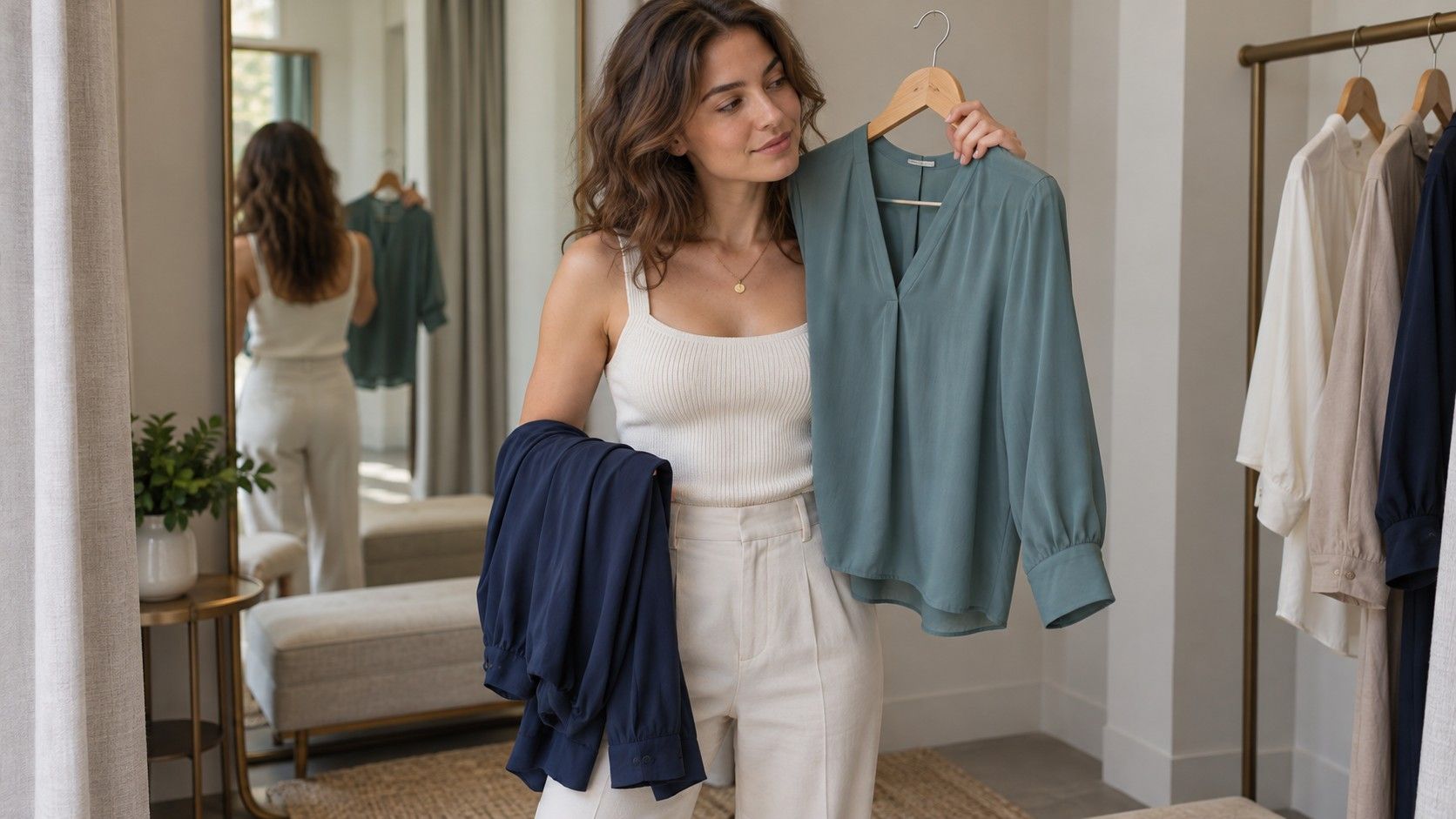
Start with a jacket or cardigan you already wear. Keep it on while changing the top underneath. For a dark layer, try a dark top first, then a medium-value one, then a light one. Stand in the same place and use the same mirror. The low-contrast combination may feel cohesive; the larger light-dark jump may feel sharper. Look for the result you want rather than assuming one must be objectively better.
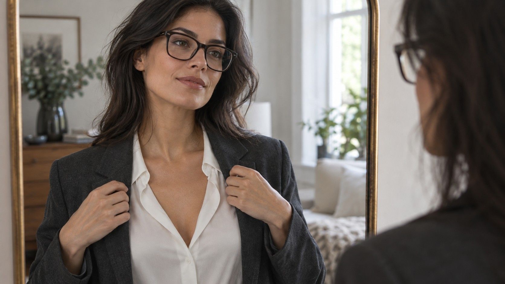
A black jacket with a white shirt is a familiar high-contrast example. Navy with medium blue gives a more moderate step, while charcoal with a nearby gray can look quieter. These are examples, not fixed measurements: a very pale blue can create a large jump against navy. Judge the actual garments in front of you. A color name on a label cannot describe its depth reliably.
Notice where your eye goes first. Does the shirt opening take over, or does it add a welcome frame? Does a nearly matched combination feel relaxed or leave you wanting more definition? Take one picture of each and look at them together after changing back into ordinary clothes. A little distance can make the difference clearer than rapidly switching shirts and trying to remember the last one.
If you like a strong contrast but want less of it beside your face, reduce the area of the lighter color. A narrow cream collar inside a dark jacket creates a smaller visual interruption than a broad white panel. Conversely, opening a dark cardigan wider over a light top makes that contrast more prominent. Placement and area can matter as much as choosing a different color.
Try patterns before replacing plain clothes
A print carries its own light-dark relationships. Small cream marks scattered across navy can read differently from wide black-and-white stripes, despite using a similar palette. View the garment from a normal conversational distance. If the pattern blends into a middle value when you step back, its overall effect may be softer than the close-up suggests. A product photograph enlarged on a screen can make every tiny mark seem equally important.
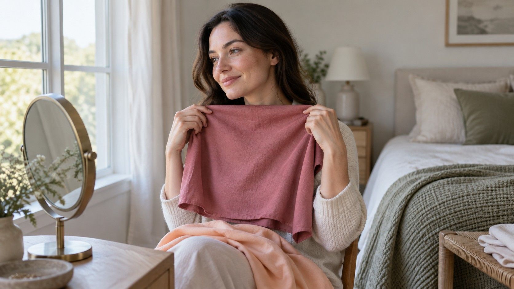
Compare a patterned scarf with a plain one while keeping the rest of the outfit steady. Position each where you would actually wear it, rather than holding the whole length under your chin. A loose scarf may reveal less of the brightest shade than a tightly tied knot. If a print feels too forceful, a plain top between it and your face may make the combination easier to wear.
You can also repeat a small dark element from your features without building an entire outfit around it. Dark buttons, a fine stripe, or a darker necklace can add definition to a softer combination. A large solid black neckline creates a different effect. Try the smaller change first, particularly if you already like the garment and are simply looking for a way to finish the outfit.
Account for glasses, hair, and makeup in daily use
Glasses form a visible frame near the eyes. Thick dark frames add a stronger light-dark element than pale translucent ones, although shape and finish influence the effect too. If you wear glasses every day, include them in your clothing test. Assessing an uncovered face and then adding a prominent frame afterward may explain why a combination seems different from the earlier photograph.
Hair color and styling change what surrounds the face. Pulling dark hair away from the cheeks reduces the dark area beside them; a fringe brings it closer. A new hair color may make different necklines feel appealing without requiring you to assign yourself a new permanent type. Test the appearance you actually wear. When exploring natural coloring separately, make a note that the visible hair is dyed and avoid pretending it is neutral evidence.
Makeup can add definition around eyes, brows, and lips. A strong lip with minimal eye makeup may balance a crisp outfit differently from a softer everyday look. Repeat the comparison in the version you need: a work outfit with ordinary makeup, for example, or an evening outfit with a bolder lip. Neither result cancels the other. They describe different combinations of visible elements.
Choose contrast for the occasion and the mood
Matching clothing contrast roughly to your features is one styling approach. Deliberately increasing or lowering it is another. A dark suit with a bright shirt can communicate the sharpness you want for an event; a close-value knit and jacket can feel quieter for a casual day. Personal taste and the formality of the setting belong in the decision. A face category should not overrule an outfit that does the job well.
Contrast is also separate from warmth and color intensity. A bright red and bright green may differ strongly in hue while sitting closer in light-dark value than expected. Black and white have a large value gap without the same color relationship. If an outfit feels too busy, identify the variable before changing it. You might keep the light-dark arrangement and choose less vivid fabrics, or keep the colors and reduce the size of a pattern.
Save three combinations you can repeat: a quiet one, a moderate one, and a sharper one. Note which neckline, frames, and hair arrangement you used. That small record makes shopping easier because you can compare a proposed purchase with an actual outfit. A high or low contrast face test has served its purpose when it helps you make those choices. It does not need to become another rule your wardrobe must obey.