One color season test says summer, a second says autumn, and a photo app suggests winter. Before taking another quiz, check what each result is based on. Seasonal color analysis is a subjective styling framework, and different systems can place the same observations in different categories. The useful question behind “what season am I?” is often simpler: which colors make choosing clothes easier? Start with repeatable comparisons, keep the labels provisional, and use the season as a way to organize a wardrobe rather than as a fact you must prove about yourself.
Check whether the results used comparable evidence
Put the results side by side and note how each was produced. A quiz about eye color and jewelry preferences, an automated selfie tool, and a fabric comparison in a room are drawing on different inputs. They should not be treated as three identical votes. A photo taken under warm indoor light may also differ noticeably from a window-light photo submitted to the same tool.
Look at the original images if you still have them. Was one filtered, more brightly exposed, or surrounded by colored fabric? Did your makeup or dyed hair change between them? You do not need to reconstruct every camera setting. Identify the obvious differences before interpreting a change of label as a meaningful discovery.
Next, read how the service defines its categories. A four-season system and a twelve-season system may divide the same broad area differently. Even similarly named palettes can vary between practitioners. Save the actual suggested colors along with the name, because the word “summer” on its own tells you less than the set of shades you were asked to try.
Compare color dimensions before chasing a seasonal name
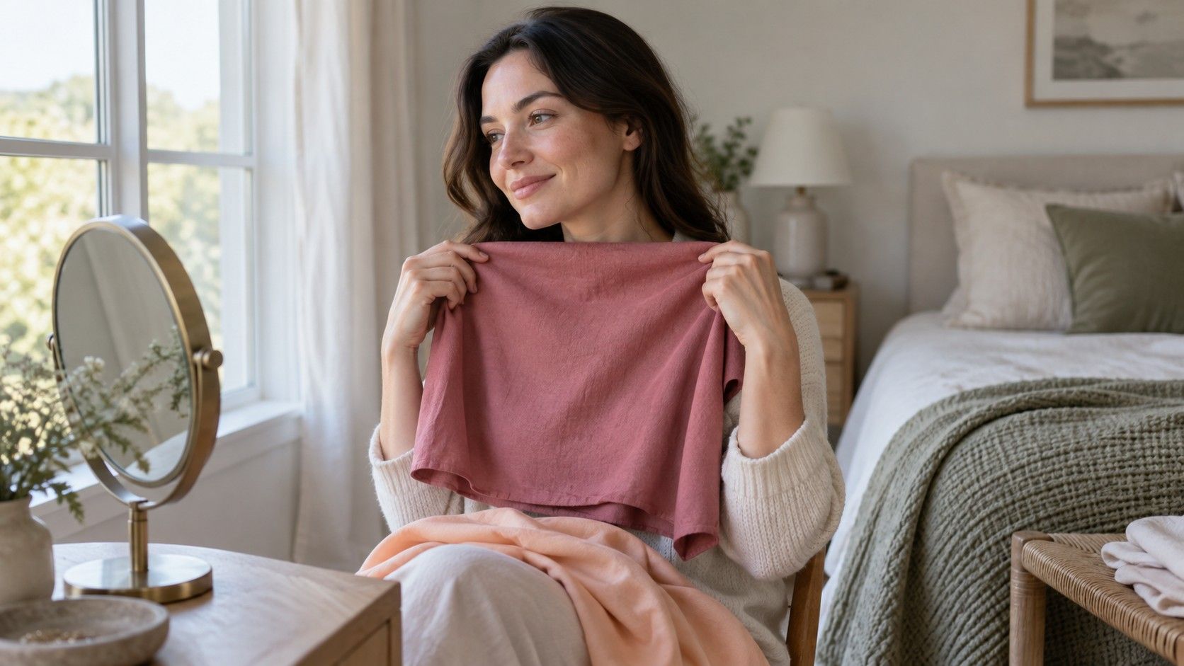
Begin with three styling questions: do you tend to prefer warmer or cooler colors near your face, lighter or deeper ones, and softer or clearer ones? These dimensions give you something concrete to compare. A label guessed from dark hair gives you much less to work with. Keep the light steady and choose fabrics that differ mainly in the property you are exploring.
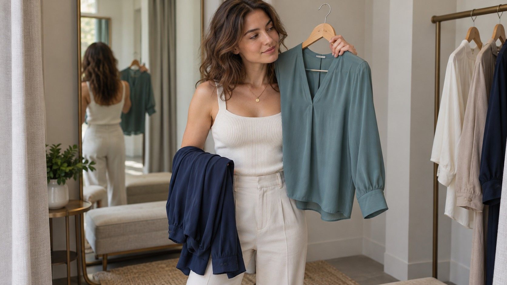
For temperature, try peach and cool rose at similar depths. For depth, compare light blue and navy. For softness, compare a dusty teal with a clearer teal of roughly similar lightness. Household fabrics are imperfect test materials, so record the pair rather than claiming it proves a universal rule. A shiny scarf against a matte T-shirt also changes texture and reflected light.
Watch the whole face and your overall impression. Which color seems to let the face remain the focus? Which creates an effect you enjoy? Reverse the order and repeat the comparison another day. If there is no stable preference, write “uncertain.” These are visual judgments, not measurements of health or objective attractiveness, and a tie is a legitimate result.
Use four seasons to find a broad direction
The familiar four-season model is a convenient starting map. Spring palettes are commonly described as warm and clear; summer as cool and soft; autumn as warm and soft; winter as cool and clear. Depth varies within these groups and becomes more explicit in expanded systems. Treat these descriptions as broad styling conventions rather than definitions of what every person's features must look like.
| Repeated preference | Broad palette to explore | A useful next comparison |
|---|---|---|
| Warmer and clearer colors | Spring | A clear warm shade against a softer warm shade |
| Cooler and softer colors | Summer | A soft cool shade against a clearer cool shade |
| Warmer and softer colors | Autumn | A muted warm shade against a cool muted shade |
| Cooler and clearer colors | Winter | A clear cool shade against a soft cool shade |
| No stable temperature preference | Keep the direction open | Check depth and softness with comparable fabrics |
Do not reject a whole group because one illustrated swatch looks unpleasant. A mustard, coral, or icy pink may be a poor example for your taste or for that particular comparison. Try several usable shades and the group's suggested neutrals. A wardrobe needs shirts and coats you can combine, so navy, gray, cream, brown, and other everyday colors deserve attention alongside the vivid examples.
When two neighboring palettes seem plausible, test their difference
If summer and autumn both seem plausible, you may already have a clearer preference for softness than for temperature. Compare muted warmer and cooler shades at similar depths. If spring and winter both attract you, compare clear shades while keeping their intensity reasonably close. Focus on the dimension separating the candidates instead of restarting the entire process.
Expanded seasonal systems can offer more specific names, but adding categories does not repair uncertain observations. A soft summer and soft autumn comparison is only useful if you can see a repeatable difference in the actual colors offered. If every test depends on a different phone photograph or a single unsuitable fabric, a narrower label adds apparent precision without better evidence.
Keep an overlap palette while you explore. Choose a few shades you repeatedly enjoy from both candidates and combine them with clothes you already own. You can learn more from wearing a muted blue knit and a soft green scarf than from comparing tiny digital swatches for another evening. A practical middle ground is allowed; there is no requirement to pick a side before getting dressed.
Keep dark hair and unexpected features in perspective
Dark hair does not automatically make someone a winter, and light hair does not automatically make someone a spring or summer. Hair contributes to the overall appearance, but a feature checklist can miss how different fabrics look beside the face. Eye color and ancestry are equally poor substitutes for the actual comparison. People with superficially similar features can have different styling preferences.
If dyed hair dominates the test, compare a few colors with it pulled back, then repeat with it visible. The first view can help you notice the face; the second reflects how you currently dress. Record which version you used rather than treating a difference as a contradiction. Your present haircut, makeup, and preferred styling all matter to a wardrobe decision.
Be cautious about dramatic before-and-after examples online. Changes in lighting, exposure, expression, and makeup can make the alleged winning palette look more convincing. Compare like with like when possible. If an unexpected result is based on steady observations with several fabrics, it deserves more attention than a rule claiming that a particular hair color must belong to one season.
Keep a provisional season useful for your next purchase
Write a short working description before a seasonal label: “prefer medium-depth, softer colors; cooler shades often win.” Add two or three favorite garments as examples. That note can guide a purchase even while the season remains unsettled. If you later refine the label, the useful observations survive instead of disappearing with the old quiz result.
Test one low-commitment item in a suggested color, such as a top or scarf, rather than replacing the wardrobe. Check it near your face, with your usual clothes, and in daylight where possible. Store lighting and online product photographs can distort expectations. Keep the return conditions in mind and judge the actual garment before assuming the palette recommendation was a success.
After a few wears, ask whether the color was easy to combine and whether you wanted to reach for it again. A season can suggest options, but fit, fabric, comfort, and personal taste still decide what earns space in the wardrobe. “What color season am I?” can remain an open question while your clothes become more coherent. Keep the colors that work, revisit the uncertain ones, and let the label follow the evidence you can actually use.