If gold and silver both look fine and neither peach nor pink wins every comparison, shopping can become oddly frustrating. A neutral undertone may describe that mixed result, but it is only a starting point. The useful next step is to compare colors in a way that separates temperature from depth and brightness, then keep the differences that matter in your own wardrobe.
When warm and cool comparisons keep ending in a draw
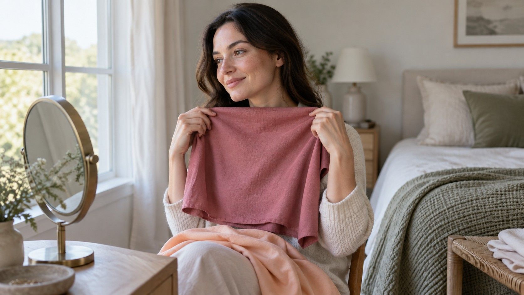
The usual test sounds easy: hold something warm beside your face, replace it with something cool, and choose the better result. In practice, a camel sweater and a pink scarf may tell you very little. One is thicker, one is brighter, and their depths are different. If you prefer the pink, temperature may have had little to do with it. Before deciding you have a neutral undertone, check whether the comparison actually isolated warmth and coolness.
Use two fabrics of similar depth and strength, such as a soft peach and a soft rose, then a warmer blue-green and a cooler blue of comparable intensity. Face a window with indirect daylight, switch off nearby yellow lamps, and keep the fabric below your chin. A cream wall or a bright green garden reflected in the window can influence the view. Choose the plainest available setting and repeat on another day if the light is changing.
Look at the face rather than asking which fabric you like. Does one make the area around the mouth seem grayer? Does the other exaggerate shadows, or does your face remain easy to see without the cloth drawing attention first? These are visual judgments, so an uncertain result is allowed. Neutral is a useful description of a small or inconsistent temperature preference; it does not need to become a verdict about your identity.
When both temperatures work but some colors still overwhelm you
A neutral undertone does not make every color equally useful. Bright coral and bright cobalt may both feel too loud, while dusty rose and faded teal sit more comfortably near the face. That pattern points toward color strength as a worthwhile next comparison. Conversely, muted beige and grayish blue may seem dull, while clearer versions feel more balanced. Test the strength before filling a basket with shades labeled neutral-friendly.
Keep one family and one approximate depth for this exercise. Compare a clear medium pink with a softened medium pink, then a clear green with a gray-green. Avoid comparing pale sage with saturated emerald: the difference in depth is too large to explain confidently. Fabric texture matters as well. Shiny satin produces highlights that a matte cotton does not, even when the colors look similar on a shopping page.
Then check depth separately. Hold a pale, medium, and dark version of a color you already wear. A person can have a small temperature preference and a strong preference for medium depth. If a near-black navy makes your face look shadowed but a medium denim blue works, write down that specific contrast. It is far more useful in a changing room than the promise that neutral skin can wear anything.
When you need whites, metals, and everyday neutrals
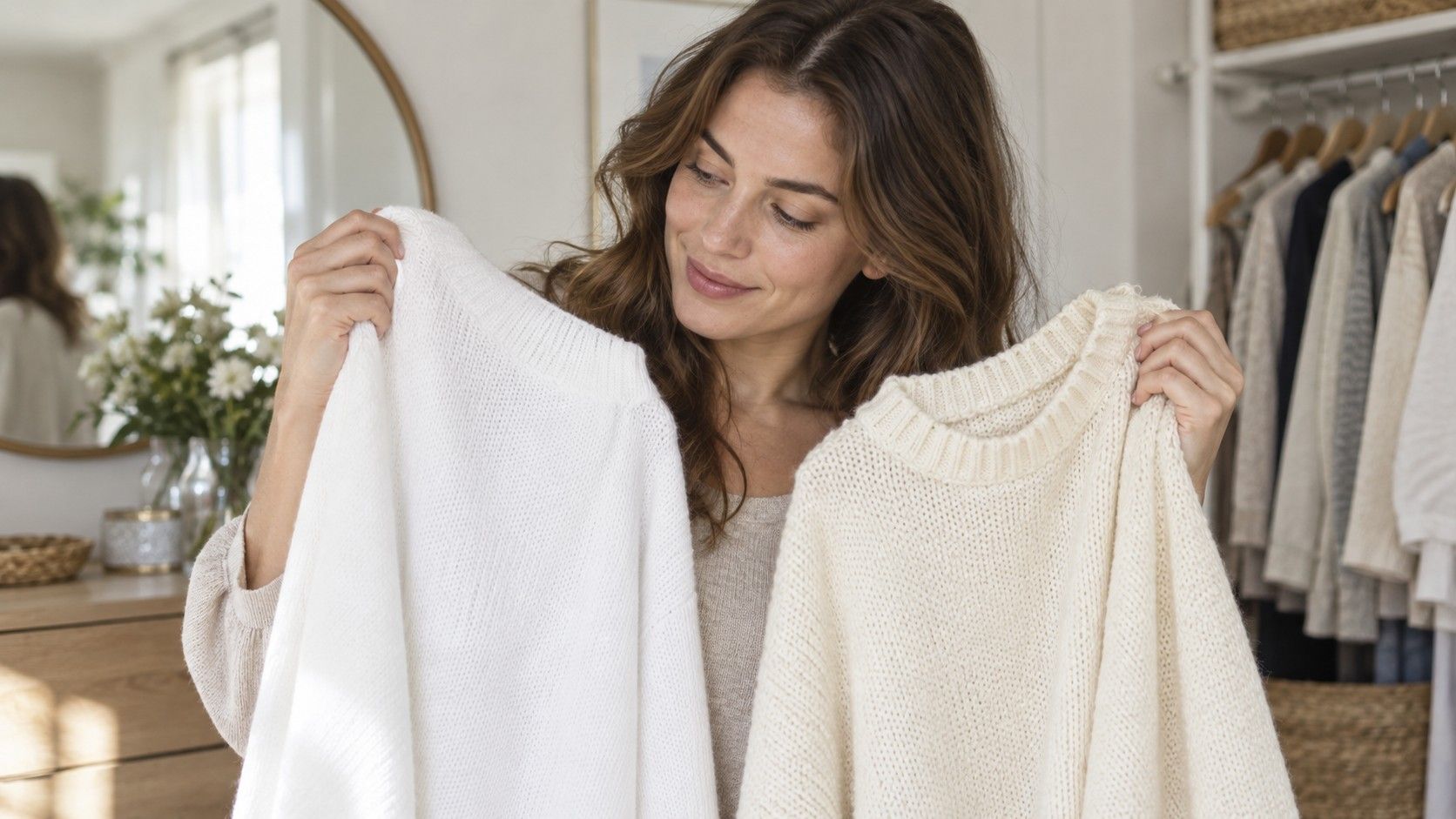
Start with the items that frame your face most often: T-shirts, shirt collars, knitwear, and glasses. Compare an optic white with a soft white and a light cream. The middle option may win, but do not force it. Some people who describe themselves as neutral prefer crisp white; others find a small amount of warmth more comfortable. Use actual clothes if possible, because online names such as ivory and ecru cover a wide range of colors.
| Purchase | Useful comparison | What to record |
|---|---|---|
| White shirt | Optic white, soft white, light cream | Which keeps the face clear without a yellow or gray cast |
| Daily sweater | Medium taupe, gray, camel at similar depth | Temperature preference and whether all three are too muted |
| Dark jacket | Navy, charcoal, dark brown | Shadow around the chin and ease of pairing |
| Metal near the face | Silver-colored and gold-colored pieces with similar finish | Preferred shine, size, and color together |
A jewelry test can suggest a preference, but it is not an undertone detector. A polished gold earring and an antique silver pendant differ in placement, finish, and size. Compare similar pieces near the face, then ask whether you actually enjoy wearing them. Mixed metals are a perfectly practical choice when both look good. Your glasses, watch, and usual jewelry do not need to pass a single temperature rule.
For wardrobe neutrals, build around two or three you can combine easily. Navy, a medium gray, and soft white can support many palettes; chocolate, taupe, and cream can support another. These are starting combinations, not prescriptions. A navy with a purple cast may behave differently from an inky greenish navy, so compare the individual garment rather than buying by the label alone.
When a seasonal palette gives you half the answers
Personal color analysis systems often combine temperature, depth, and clarity into seasonal palettes. A neutral result in a home test does not by itself select a season. A soft, light palette and a clear, deep palette can both include colors that are neither strongly warm nor strongly cool. If you skip the other comparisons, you may collect a set of reasonable-looking swatches that have very little in common.
Use a seasonal palette as a group of candidates. Choose three colors from it that you can find in real fabric and compare them with three alternatives. A repeated preference for softened medium colors is worth keeping even if one suggested peach fails. Equally, one excellent blue does not prove that every neighboring swatch will work. A palette earns its place by making purchases easier, not by requiring you to defend every color inside it.
If two online tools disagree, inspect the inputs before trying a third. Camera white balance, filters, exposure, and the colored wall behind you can alter the apparent relationship between skin and cloth. A photo taken under a bathroom bulb and a photo beside a window are not equivalent tests. Use pictures as notes, keep the setup consistent, and give the mirror comparison in stable daylight more weight than a changing screen result.
When you are shopping and need a decision in five minutes
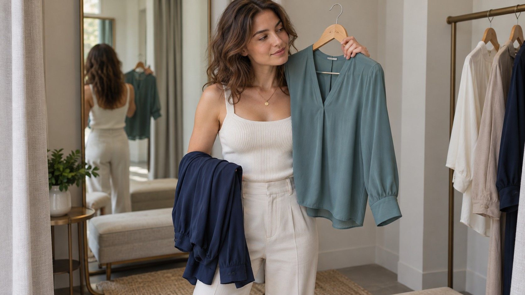
Bring a known successful top, or wear it under a layer you can remove. Compare a new collar or scarf with that familiar reference. Store lighting can make white look creamy and can shift muted colors, so move toward a window if the shop allows it. If you cannot check daylight, use the return policy as part of the decision. Uncertainty is a reason to postpone an expensive purchase, not to buy several speculative colors.
Keep a short note with useful distinctions: soft white over bright cream; medium navy over black; muted teal over vivid turquoise. Add the garment and lighting conditions, plus whether the preference was strong or slight. Three repeated observations are more persuasive than a long list from a single afternoon. A photograph of the fabric beside your reliable top can help, although the phone may change the color and should not replace a fresh comparison.
When a favorite shade sits outside the pattern, consider placement. A strong orange bag has a different visual role from an orange turtleneck. Trousers, shoes, prints, and small accents let you use colors you enjoy without demanding that every shade be ideal beside your face. Even a less convenient top can become easier to wear with an open neckline or a familiar scarf. The aim is a wardrobe you use, with fewer disappointing purchases.
If you keep returning to the question what is my undertone, stop testing for a week and wear the best combinations you have already found. Notice which outfits feel easy in ordinary daylight and which require constant adjustment. A working palette can be clear before the label is. Keep the evidence specific, leave room for slight warm or cool preferences, and let the clothes settle the practical question.