Olive is often treated as a shortcut to warm colors, yet that shortcut can lead to a wardrobe full of disappointing beige. An olive skin tone can look warmer, cooler, or relatively neutral in personal color comparisons. The practical question is which fabrics work beside your face in consistent light, and which differences remain when brightness and depth are held roughly steady.
When the word olive seems to imply a skin depth
In everyday beauty and styling language, olive usually describes a perceived greenish or gray-green quality in the skin. People use the word inconsistently, so it is better treated as a description than a precise measurement. It does not tell you how light or dark the skin is. Fair olive skin and deeper olive skin can both be described this way, and neither description selects a seasonal palette on its own.
Depth is the light-to-dark comparison; temperature describes the warmer or cooler impression used in styling. These are separate questions. A fair face can look relatively cool beside peach fabric, while a darker face may favor warmer colors, or the reverse. Ethnicity, nationality, and a tendency to tan do not establish the answer. Keep the comparison tied to the person and the fabric in front of the mirror.
There is also a difference between seeing an olive quality in a photograph and finding useful wardrobe colors. A camera can introduce a green cast through white balance or reflected surroundings. If the description only appears in one bathroom mirror or one phone image, test it elsewhere before reorganizing your wardrobe. You can choose good colors without proving that olive is the perfect term.
When you need a fair warm-versus-cool test
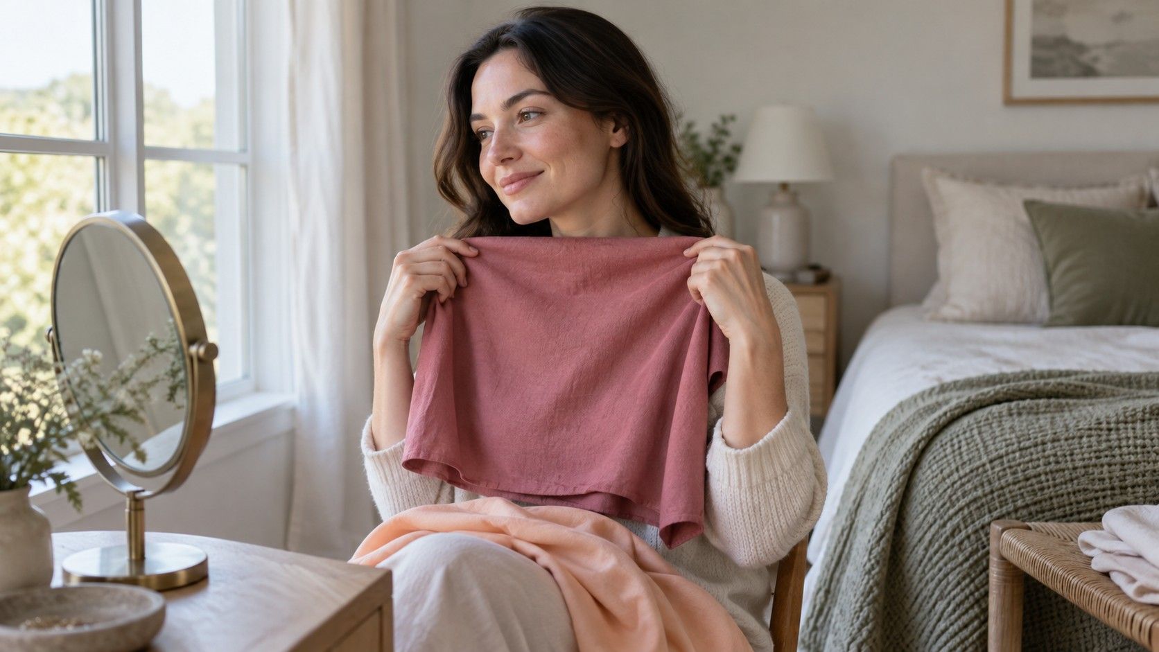
Begin beside a window in indirect daylight, with the room lamps switched off. A plain background makes comparisons easier, particularly if a bright wall or curtain would reflect onto the face. Remove strongly colored scarves and, for the comparison itself, use as little complexion makeup as feels comfortable. Keep the light, mirror, and distance the same while changing fabrics; otherwise you introduce another variable with every swap.
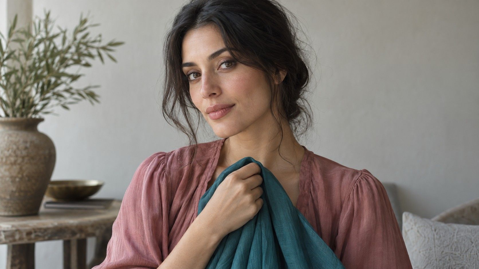
Choose similar depths and strengths on each side. Try a medium warm rose against a medium cool rose, or a softened peach against a softened pink. A bright orange and a pale blue differ too much to isolate temperature. Include another color family before deciding: a warmer green against a cooler blue-green can help show whether the first preference repeats. Fabric names are unreliable, so look at the actual pieces rather than their online descriptions.
Watch the face as the cloth changes. Does the area around the mouth look more shadowed? Do you notice the fabric before the face? Does one option make the face seem less even in color? These impressions are subjective, but repeated differences can guide purchases. Avoid requiring the face to become brighter at any cost; a very pale cloth can reflect extra light upward without being your most useful wardrobe color.
If the warm pair wins once and the cool pair wins once, keep the result open. The better predictor may be mutedness or depth. Compare a subdued color with a clearer version at similar depth, then compare a medium with a darker version. A small temperature preference can coexist with a much stronger dislike of very bright or very pale clothing.
When fair olive skin looks pink in one place and yellow in another
Fair olive skin can be difficult to describe because different areas of the face may show different apparent colors. Pink cheeks do not automatically make the whole face cool in the styling sense. Equally, a yellowish impression under a warm lamp does not establish a warm undertone. A visual description of skin and a useful clothing palette are related questions, but one cannot reliably stand in for the other.
Compare the overall face with the neck in the same light, and avoid basing a decision on a tiny patch of cheek or wrist. Veins are a particularly uncertain shortcut: their apparent color depends on lighting, visibility, and surrounding skin. A green-looking vein is not enough to settle whether olive skin is warm or cool. Treat it as a weak observation if you record it at all.
For a home test, repeat a small set of fabrics on two ordinary days. Keep a neutral top nearby as a reference and do the test before adding lipstick or a strongly colored blush. If a warm rose works repeatedly while a pale peach disappears against the face, note those exact results. They are more actionable than trying to decide whether a slight yellow-green cast must fit a particular category.
A sudden change in how your face appears is outside the purpose of a styling comparison. This exercise is about clothing under consistent light. It should not turn everyday color choices into explanations about health or into a search for a supposedly correct natural skin color.
When the usual olive-skin color lists do not work
Many lists recommend jewel tones, earthy shades, or both. Those categories are broad enough to hide the useful differences. A dark clear emerald and a pale dusty sage are both green, yet they place very different demands on the rest of an outfit. If one works and the other does not, olive skin has not failed a rule. The rule was too loose to make the choice.
| If this happens | Compare next | Useful clue |
|---|---|---|
| Orange overwhelms but rust works | Two orange-based shades at similar depth, one clearer and one softer | Color strength may matter more than the warm label |
| Black feels heavy but navy works | Charcoal, medium navy, and dark navy | Depth and contrast deserve a separate test |
| Beige blends into the face | A rosier taupe and a slightly deeper neutral | The beige may be too close in depth or too yellow |
| Both warm and cool roses work | Muted and clear roses at similar depth | Temperature may be a smaller preference |
Use the table to design the next comparison, not to diagnose a season. A successful rust sweater does not prove that all autumn colors will work. It may be the matte finish, the medium depth, or the relatively softened color that makes it useful. Repeat the favorable feature in another family before treating it as a wardrobe pattern.
For prints, look at the overall effect from conversational distance. A small warm detail inside a mostly cool pattern need not ruin an otherwise useful shirt. The background, contrast, and amount of each color often matter more than the presence of one theoretically unsuitable shade. Bring the print up to your face and compare it with a plain top you already trust.
When you are choosing neutrals or interpreting makeup results
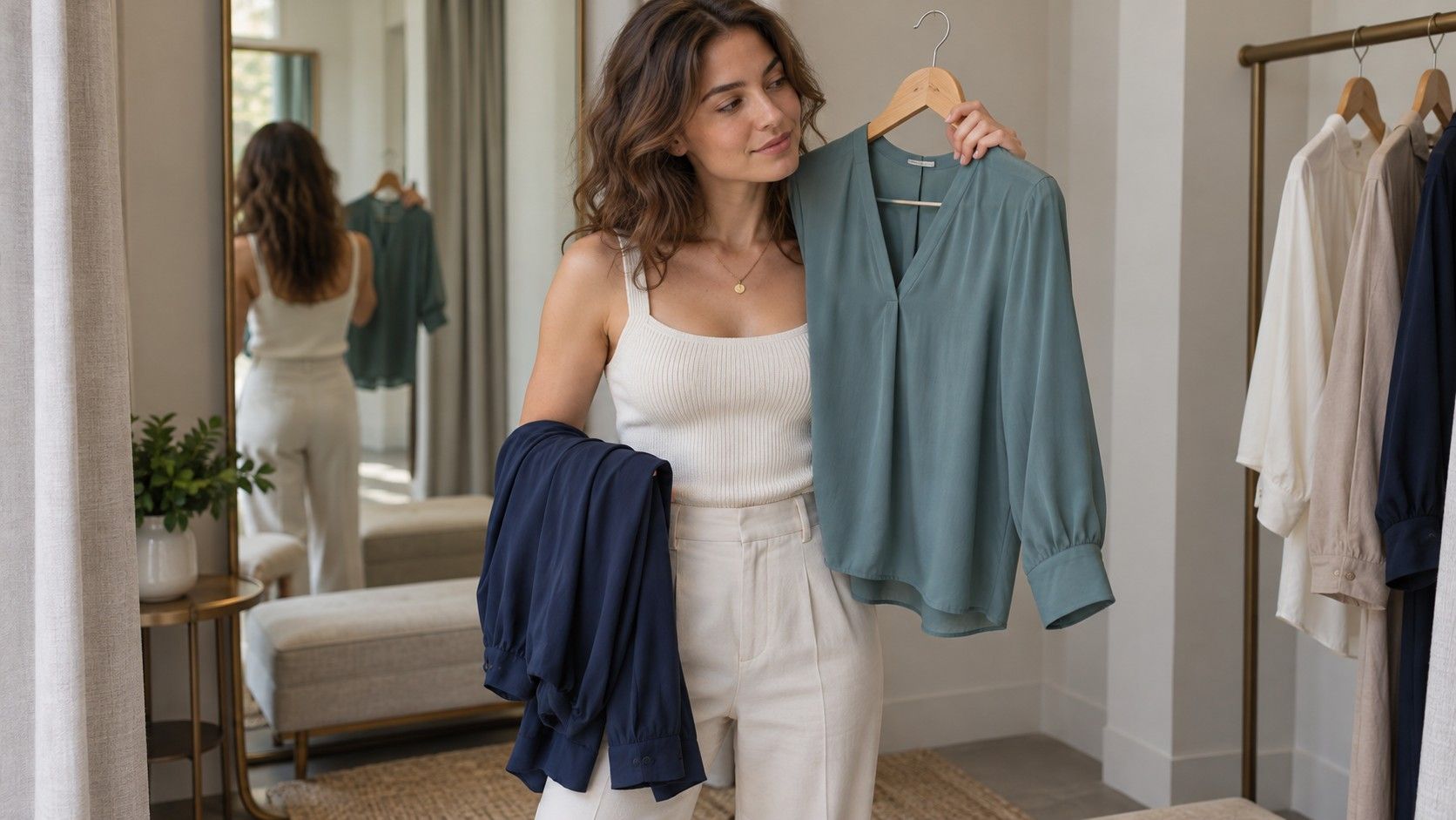
For a first set of neutrals, compare navy, charcoal, taupe, and brown rather than buying a large beige capsule at once. Match their depths as closely as you can. Then test soft white against optic white and cream. A cream that reads yellow on one face can look comfortable on another, so the label olive should not dictate the winner. Choose two or three reliable neutrals that work together with your existing shoes and outerwear.
Makeup observations can provide extra clues, provided you keep them separate from clothing conclusions. A base product that looks too pink, orange, or gray may reflect its particular pigment mix, depth, finish, or how it looks after wear. It does not prove your season. Product ranges also use warm, cool, and neutral labels differently, which limits comparisons across brands.
If you wear complexion makeup, inspect a candidate near the jaw in daylight and compare it with the neck rather than judging a thick patch on the hand. Follow the product's own application instructions and allow for its normal settling time. The practical question is whether the result fits your intended look, not whether the shade name agrees with an internet undertone quiz.
Keep a short shopping note with actual successes: medium navy; soft rose rather than pale peach; charcoal better than near-black; cream uncertain in store light. Include a small fabric reference when possible. When an item is expensive or difficult to return, postpone the decision until you can compare it in better light. A repeatable preference is worth more than a quick olive label, and a useful palette can remain slightly flexible.