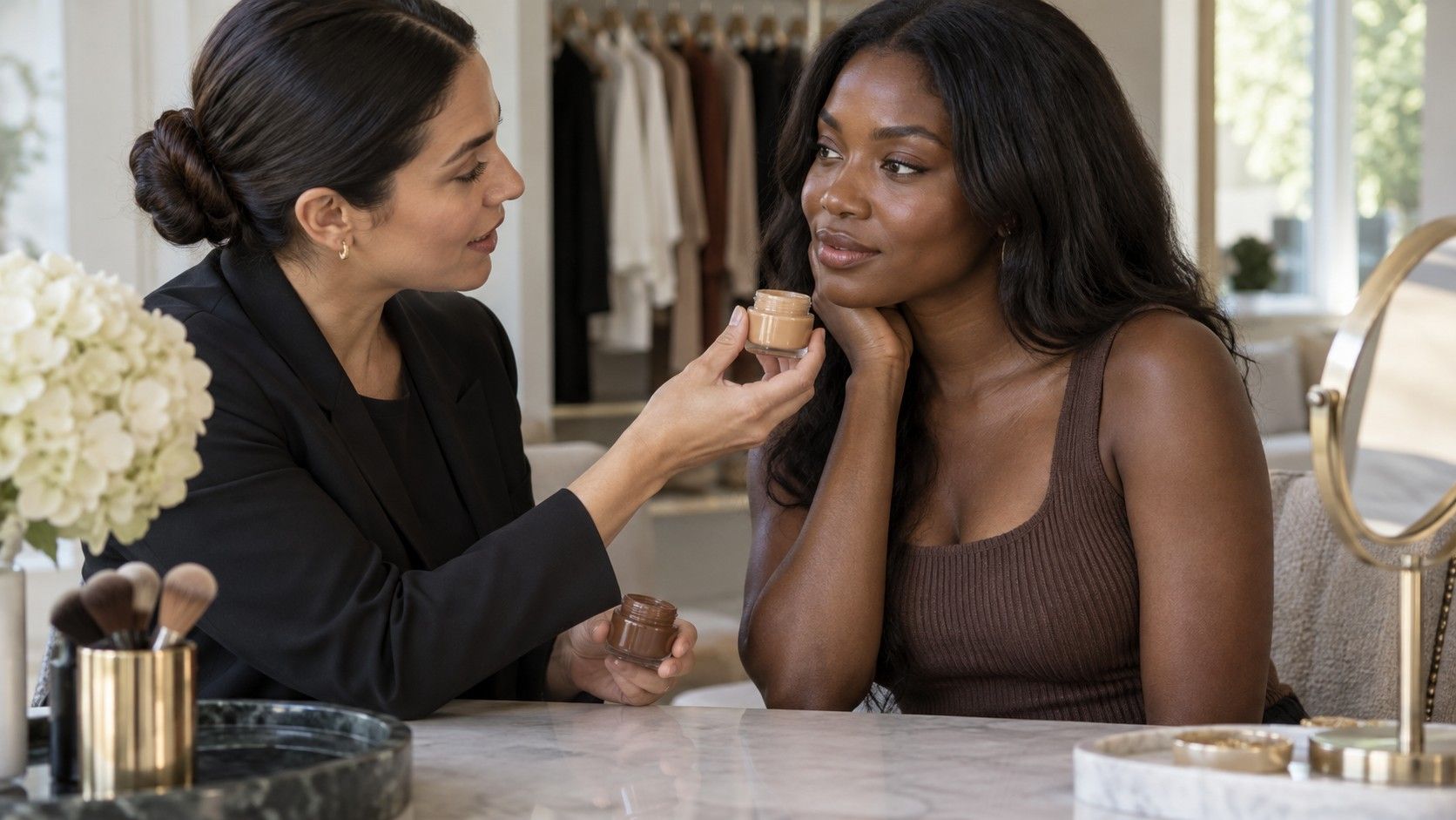
A skin tone chart can help you describe what you see, but it becomes confusing when its labels start sounding like fixed identities. One chart calls a square medium, another calls a similar square tan, and neither looks quite like your face beside the screen. Use the chart as a rough reference for a particular task, such as narrowing foundation samples or describing color depth. Keep that task separate from choosing a seasonal wardrobe palette, which involves subjective comparisons with real colors rather than matching your skin to a named box.
First check what the chart is trying to describe
Look for a key or explanation before comparing yourself with the pictures. Some charts show a progression from lighter to deeper colors. Others divide samples into warm, cool, and neutral groups, or arrange a cosmetic brand's foundation shades. A page with several rows of similar beige squares may be doing more than one of these jobs. Without the labels, the layout can be easy to misread.
Ask a practical question: is this chart helping you choose a product, describe an approximate appearance, or explore clothing colors? A foundation chart is designed around the products in that range. It is not a universal catalog of human skin. A seasonal palette chart serves a different purpose again: its swatches represent colors to wear, rather than colors your skin should match.
Names are shorthand. Fair, light, medium, tan, deep, and similar terms can be useful within a clearly explained range, but they do not have identical boundaries everywhere. Avoid spending an afternoon trying to settle whether you are officially one word or the next. Write down the relevant chart or brand and the two neighboring examples you are comparing. That preserves useful context.
Separate lightness from the warm-or-cool question
Depth describes how light or deep a color appears. Undertone language describes a different aspect of appearance, commonly using warm, cool, neutral, or olive descriptors in cosmetics. A deeper shade is not automatically warmer, and a lighter shade is not automatically cooler. If a chart moves diagonally through both properties, a single nearest-looking square can hide which feature you matched.
Try reading one row or column at a time. If the chart offers several depths in the same undertone family, compare those first for approximate lightness. Then look across the undertone options at a similar depth. This does not turn a screen comparison into a precise measurement, but it keeps you from treating every difference as an undertone difference.
| Chart feature | What it can help describe | What it cannot establish alone |
|---|---|---|
| Light-to-deep sequence | A rough range of visible depth | Your best clothing colors |
| Warm, cool, neutral labels | The chart's undertone categories | A universal category shared by every brand |
| Olive descriptor | A possible direction to explore in shade matching | A particular ethnicity or seasonal type |
| Named foundation swatches | Options within that product range | The same shade in another formula |
| Seasonal color swatches | A proposed wardrobe palette | A match to your skin color |
A yellowish appearance in one photograph is also not enough to settle a warm undertone. Room light, the camera, makeup, and nearby fabric can all influence that image. Treat quick vein-color or jewelry tests as personal observations if you find them helpful, rather than a tie-breaker that must override everything else you see.
Stop holding the screen beside your face as if it were a swatch
A phone emits light; your face reflects the light around it. Holding the two together therefore compares different viewing conditions, even before brightness and screen color settings enter the picture. A skin color chart may look warmer with a night display mode enabled and cooler after it is disabled. The same image can look different on a laptop across the room.
For a rough viewing reference, keep the display settings stable and use an evenly lit room. Avoid a warm lamp shining on your face while the chart sits on a bright, cool-looking screen. Turning off an obvious color-shifting display mode can remove one source of variation, but it does not calibrate the screen or make the chart accurate enough for a guaranteed product match.
Photographs add another step. A selfie taken near a window and one taken under a kitchen light may suggest different matches on the same chart. If you use a photo, keep an original without filters or deliberate warmth adjustments and note its lighting. When the apparent match changes between photos, investigate the photos before deciding that your undertone has changed.
Read shade names as labels inside one product range
A skin tone chart with names can feel more authoritative than an unlabeled grid, yet names such as sand, honey, ivory, and caramel are brand language. They do not provide a dependable conversion between companies. Even familiar codes such as warm or neutral need the maker's explanation. A matching name on two bottles can still lead to visibly different shades.
Record the full product name, formula, shade code, and shade name together. A foundation and a concealer from the same company may use different numbering or have different intended effects. If you only save “medium neutral,” you lose the information needed to find the sample again. A photograph of the packaging can be more practical than a long list of approximate descriptors.
Use the chart to narrow the options you would like to try, then check the actual product where possible. Read the product's directions for application and allow any stated settling time before judging the finish. Check how the shade looks in your ordinary daylight as well as store lighting. The relevant result is how that formula looks on you, not how closely its online square resembles another online square.
Notice where you are comparing, rather than chasing one exact square
Your face, neck, and hands may not look identical. Different lighting angles, makeup, and ordinary variations across the body make a single whole-person swatch an awkward goal. A hand held next to the screen may be convenient, but it does not automatically answer a question about a product worn on the face. Choose the comparison area for the task and keep it consistent.
For wardrobe experiments, the face beside the garment is usually more relevant than a close-up photograph of the wrist. For a cosmetic shade, follow the brand's suggested matching method and consider how the result sits beside the surrounding visible skin. These are separate decisions. There is no need to force the observations into one permanent label that explains every part of your appearance.
Keep descriptions modest: “between these two depths in this range” or “this sample looks more peach than the neighboring one.” Such notes are easy to revisit. Avoid assigning tone from nationality, ancestry, or hair color, and avoid assuming everyone with a similar-looking complexion will prefer the same clothes. Those shortcuts discard the comparison you are trying to make.
Carry the chart's clues into a real color comparison
If your goal is personal color analysis, put the chart aside after it has clarified the vocabulary. Gather a few fabrics and compare them near your face in steady, indirect daylight. Try similar depths when exploring warmer and cooler shades, and similar color families when exploring light versus deep. A pale peach against a dark navy changes too many things at once to explain the result neatly.
Write down what happens with the actual garments. You may prefer a cool blue shirt, a softly warm cream knit, and a deep green scarf for different reasons. That is useful wardrobe information even if a chart led you to expect a narrower answer. Seasonal typing is an interpretive styling system, so a skin descriptor cannot by itself prescribe your season.
Save the chart only if you can explain what it helps you do next: request two samples, remember a product code, or discuss a visual preference more clearly. When it leaves you debating names without improving a purchase or outfit, it has reached its limit. The most useful match is the one you can check with a real item in the conditions where you will wear it.