A camera can help you compare colors near your face, but it can also change the very colors you are trying to judge. Automatic white balance, exposure shifts, and a nearby colored wall may make the same person look warmer in one frame and cooler in the next. Treat a skin undertone test with a camera as a way to record controlled comparisons. The aim is to notice which fabrics you prefer beside your face, then check that impression in a mirror before using it to choose clothes or cosmetics.
Distinguish surface color from undertone
In personal color analysis, undertone is a styling term used to describe a warmer, cooler, or more neutral color direction. It is different from how light or deep skin looks. A person with deep skin can consider cooler colors; someone with light skin can prefer warmer ones. Broad skin-depth labels and ethnicity cannot determine a seasonal palette. If a test makes that leap, its result deserves a careful second look.
Surface appearance varies across the face. Cheeks may appear pinker than the jaw, and the forehead may photograph differently from the neck. A camera reading taken from one small patch can therefore produce a different answer when the sample point moves. Makeup, tinted products, reflected light, and the camera's processing add further differences. A warm-looking cheek in a selfie is not enough evidence to choose a whole wardrobe.
Rather than hunting for one hidden color, observe relationships. Compare a warmer and cooler fabric of similar depth, then look at your whole face and the visible neck together. Are you drawn to one combination consistently? Does the preference survive a second comparison? This keeps the test connected to a practical styling choice. It also avoids turning a photograph into a precise measurement that the setup cannot support.
Control camera white balance before comparing frames
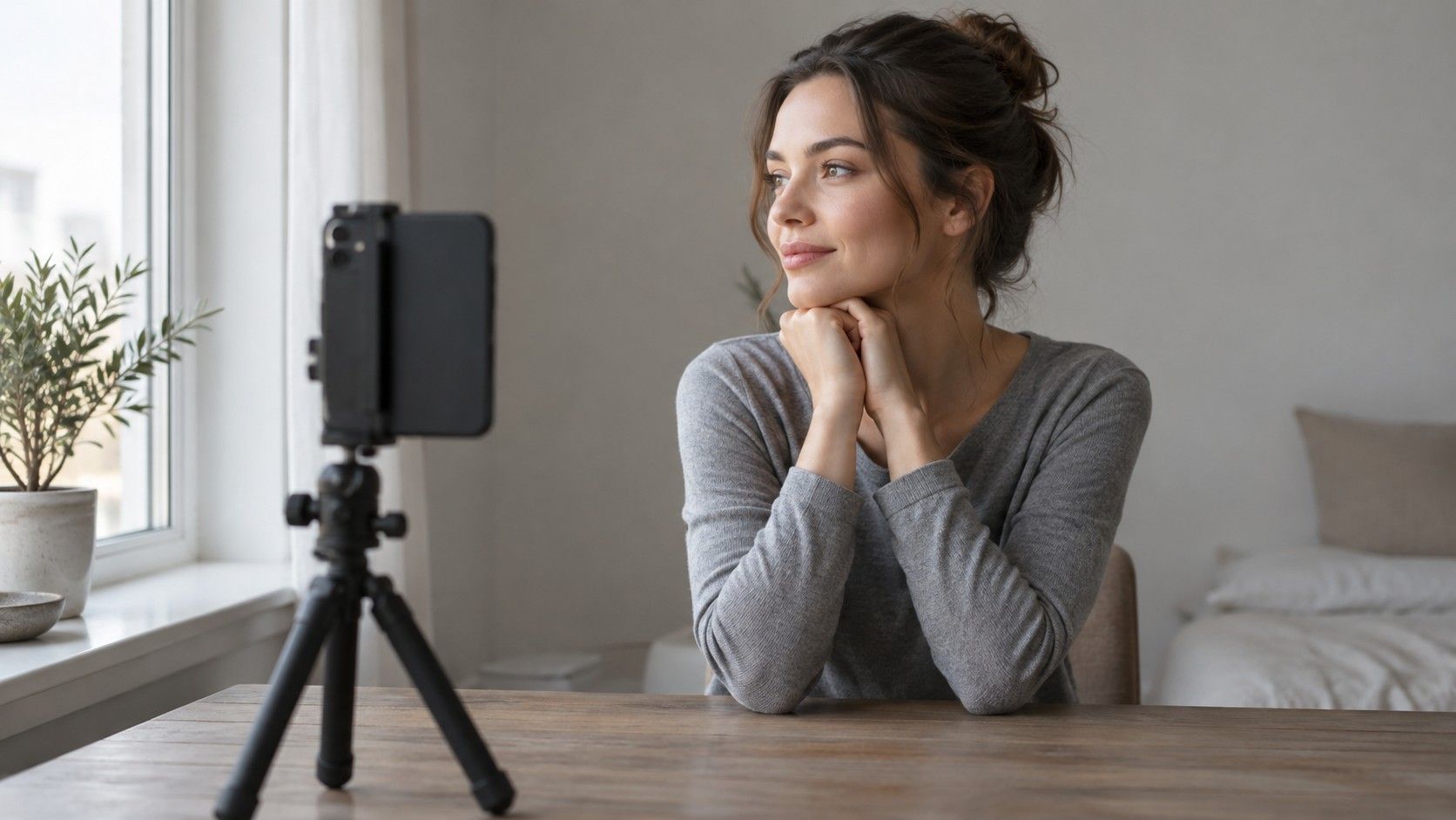
Choose indirect daylight in one place, such as a window without a beam of sun falling across your face. Switch off nearby lamps so the camera does not have to handle two differently colored light sources. Face the window and keep your background simple. A strong green wall, red curtain, or colored shirt can reflect onto skin. Move away from those surfaces or cover the bright garment with a neutral cloth while setting up.
Clean the lens and turn off beauty filters, portrait retouching, and any obvious color filter. If your camera app offers exposure and white-balance locks, use the same settings for the whole comparison. Features vary by device, so check the controls available in your own app. An exposure lock alone does not necessarily lock white balance. Keep the phone at the same distance and angle, with your face occupying roughly the same part of the frame.
Place a neutral gray or white object at the edge of each frame as a rough consistency reference. It is not a calibration system, but a visible shift in that object is a warning: the camera may have changed its rendering between shots. If the reference looks yellow in one picture and blue in another, do not attribute every change in your face to the fabric. Retake the pair or compare the fabrics directly in the mirror.
Some phones adjust a scene when a large colored cloth enters it even after you have kept other settings steady. This is one reason to frame both photos in the same way and keep some neutral background visible. Do not correct each picture separately with an editing slider until it looks pleasing. That removes the common conditions needed for the comparison.
Compare warmer and cooler drapes one pair at a time
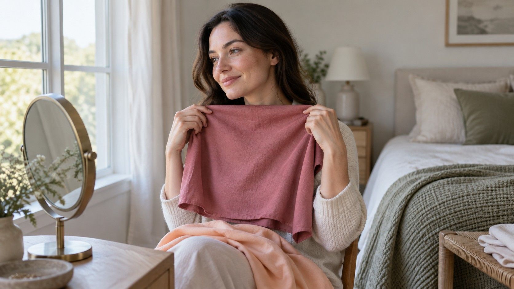
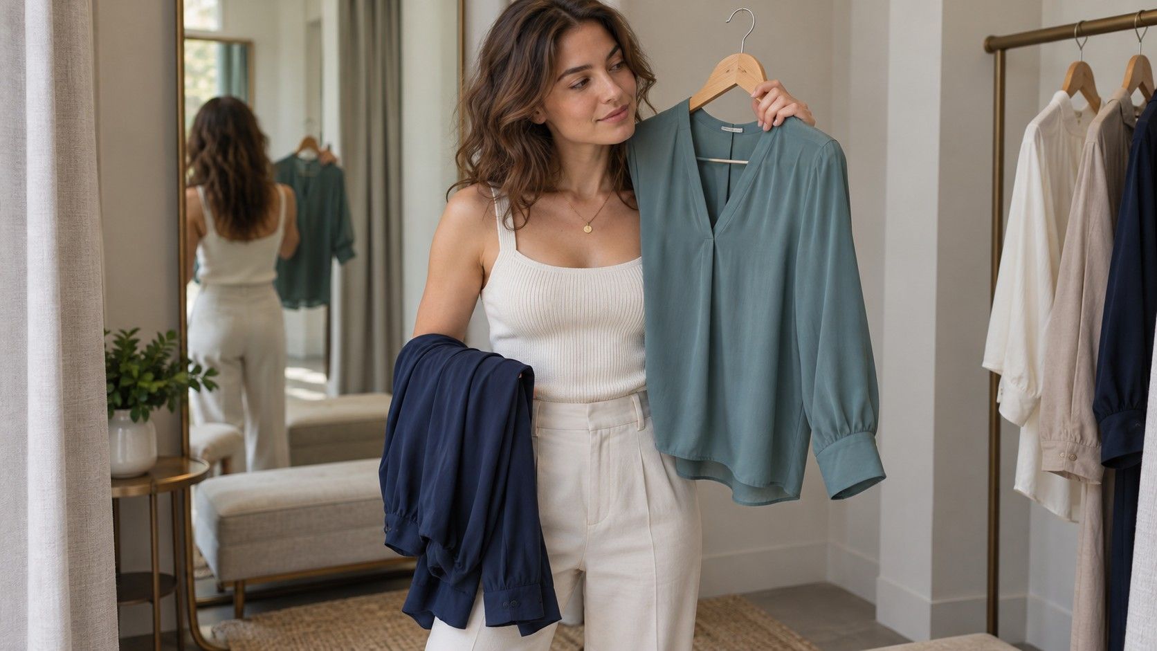
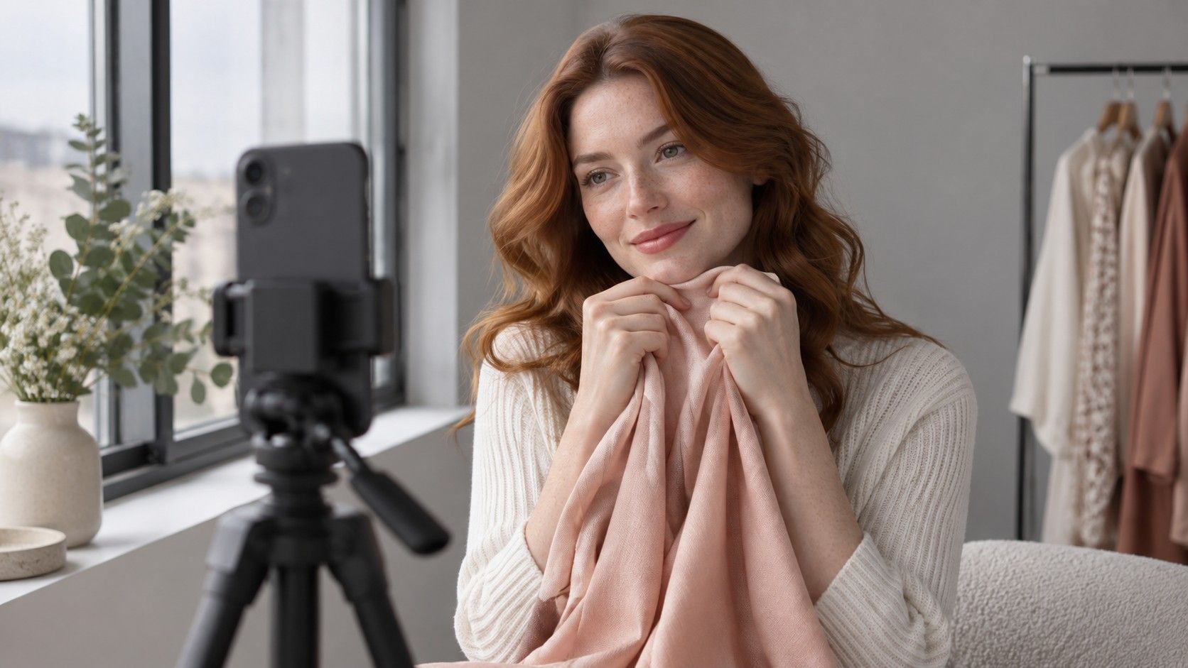
Start with ordinary matte clothing: two plain tops, pillowcases, or scarves can work. Hold each under the chin in turn, covering roughly the same area. Choose a pair with similar lightness and intensity, such as a cooler rose and a warmer peach of comparable softness. A neon orange against a pale dusty pink is too uneven a match to isolate warmth. If that is all you have, record the preference without claiming to know its cause.
Take the photographs within a short session, then return to the mirror. Look at the face first. Compare the impression around the eyes, mouth, and jaw, and whether the fabric seems balanced with your features. Avoid judging by how smooth the phone makes the skin look: processing and exposure can influence that. You are choosing an appearance you enjoy, rather than trying to make every shadow disappear.
| What changes between pictures | Possible source | Practical next step |
|---|---|---|
| The reference cloth changes color too | White balance or changing light | Reset the setup and retake both photographs |
| One face looks much brighter overall | Exposure or reflected light | Check camera settings and compare in the mirror |
| A bright drape dominates both images | Color intensity may be the main difference | Try a softer pair with similar depth |
| A preference repeats in the mirror and photos | A useful styling observation | Check a second color family before generalizing |
Repeat with another pair, perhaps warmer brick and cooler berry, again keeping depth reasonably close. Write down a plain conclusion: “berry preferred to brick in this pair.” If one family favors warmer shades and another favors cooler ones, keep that result. Fabric comparisons do not have to deliver a clean binary answer. A neutral or mixed direction may be a more useful working description than a forced category.
Understand why veins do not settle the question
The familiar vein test asks whether wrist veins look blue, purple, or green. It is appealing because it requires no equipment, yet the colors can be ambiguous even before a camera enters the process. Light, the appearance of surrounding skin, and the way the image is displayed affect what you see. A wrist photograph is also a poor substitute for comparing clothing at the face, where the styling decision will matter.
If you are searching for a “blue veins undertone” answer, resist treating blue as a final verdict. Two veins on the same wrist may look different, and the inside of the arm may not resemble the face in a selfie. Zooming into a compressed image and sampling pixels adds numbers without necessarily adding useful certainty. Those values describe that processed picture under that light, rather than a stable palette assignment.
Gold-versus-silver jewelry has similar limits as a shortcut. Metal finish, size, shine, and your preferred style all influence the comparison. A large polished gold hoop and a small brushed silver stud do not isolate metal color. If you enjoy the experiment, use pieces with similar finish and scale, then compare them beside your face. Treat the outcome as one preference to check alongside fabric, rather than a deciding vote that overrides everything else.
Repeat the test before choosing cosmetics
Try a second short session on another day with the same position, plain background, and fabric pairs. Keep the photographs together with notes about lighting and camera settings. Review them on the same screen, since displays can render colors differently. A warm screen mode or strong brightness adjustment makes tiny color judgments less dependable. If mirror and camera disagree repeatedly, give more weight to the comparison you can assess directly in ordinary daylight.
For foundation, a warmer or cooler clothing preference is a starting question, not a shade match. Products with the same undertone label can differ in depth and color, and shade names are not consistent across brands. Compare appropriate samples around the jaw and neck under the conditions in which you expect to wear them. Follow the product's own directions and assess its appearance after the time suggested for that formula. A selfie alone cannot confirm the match.
Keep blush and lipstick decisions equally specific. You may prefer a muted rose for daily wear and a warmer red for a deliberate evening effect. That does not invalidate the camera session. Styling includes the contrast and mood you want to create, as well as how closely a shade fits a seasonal palette. Save the successful combination and the actual product name rather than trying to remember whether its marketing description said warm or cool.
The best outcome from an undertone test is a small set of repeatable observations: two fabrics that consistently work, a light setup that stays stable, and a few cosmetic samples worth comparing in person. If the result remains uncertain, keep the uncertainty visible in your notes. You can still make good choices one garment or shade at a time without asking your camera to deliver a definitive diagnosis.