Soft Summer and Soft Autumn can be difficult to separate because both point toward colors with a muted quality. A gentle green knit may look at home on either mood board, while the difference between two dusty pinks is hard to judge on a screen. The useful question is whether a cooler or warmer version works more consistently beside your face. Test that difference with actual fabric, keeping depth and softness reasonably similar. You can build a useful wardrobe from the overlap while the seasonal label remains unsettled.
Start with their shared muted quality
In common twelve-season color systems, Soft Summer usually describes a muted palette leaning cooler, while Soft Autumn describes one leaning warmer. Exact swatches vary between systems and analysts. The labels do not name standardized fabric colors, so two online palettes carrying the same name may differ. Use them to choose comparisons, then judge the garments themselves. A retailer's description of “soft sage” does not place a sweater in a season.
Before separating the two, check whether muted colors are the useful common ground. Compare a dusty pink with a clearer pink of similar depth, or a softened green with a more vivid one. Hold each near your face in indirect daylight. Does the softer fabric feel balanced, or does it leave you wanting more color? If brighter shades repeatedly work better for the effect you want, neither soft palette needs to be the starting assumption.
Muted does not have to mean pale, gray from head to toe, or visually flat. A medium-depth blue-green and a subdued berry can still carry enough color for an interesting outfit. The key is their relative softness beside clearer alternatives. People sometimes choose a palette from photographs of beige clothing, then feel disappointed that it offers so little variety. Look at actual color families before deciding what either season allows.
Compare cool rose with warm terracotta carefully
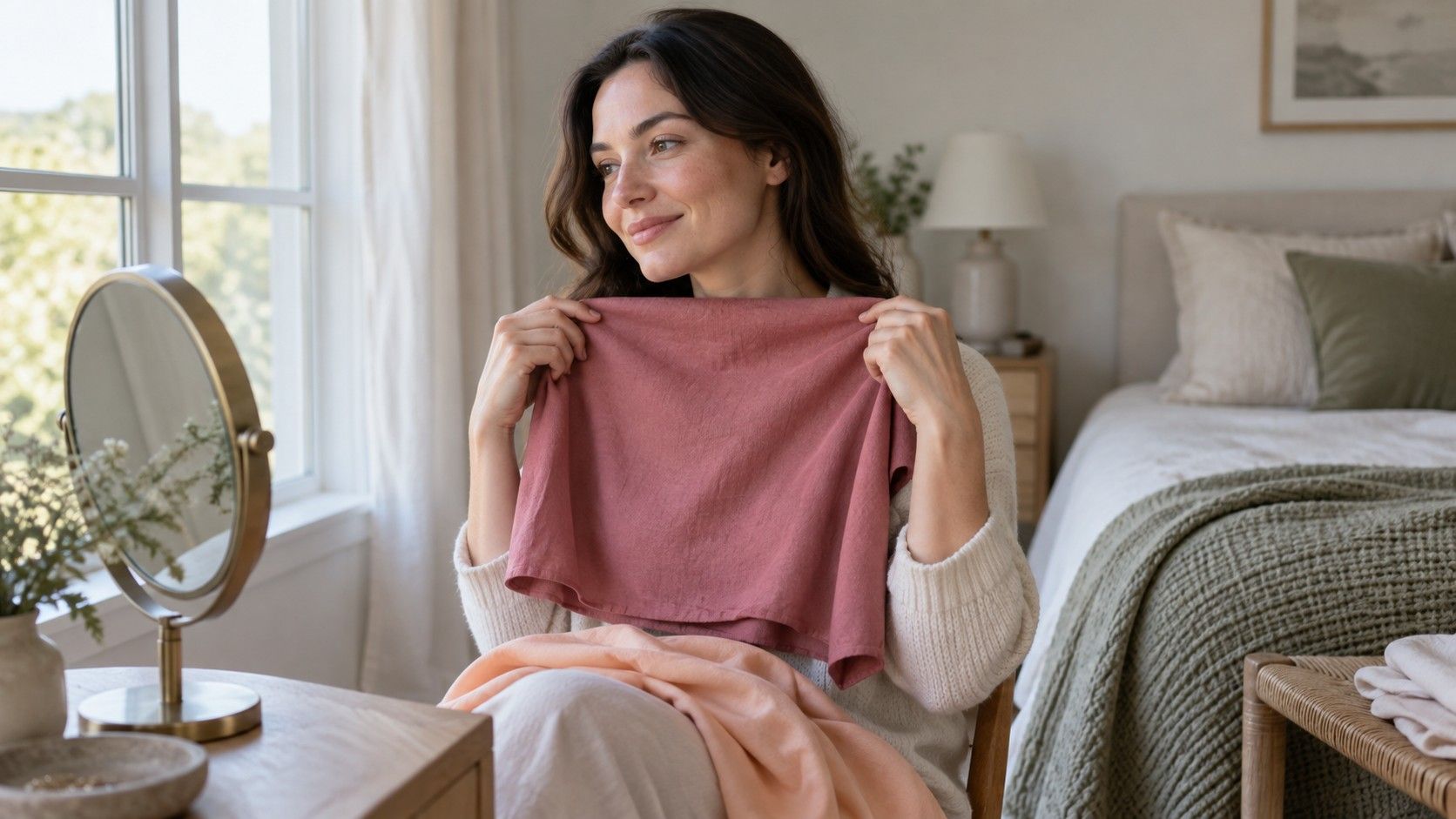
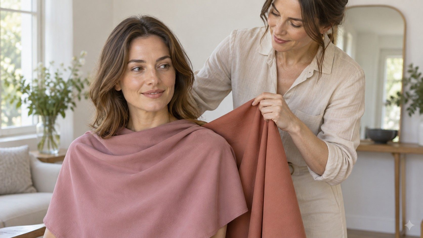
A cooler rose and warmer terracotta can make a useful first pair if both fabrics are similarly muted and neither is dramatically darker. Place one under your chin, then the other, while standing in the same spot. Watch the face rather than admiring the cloth. Which combination feels more even? Which lets you see your features before you notice the neckline? Those are visual preferences to repeat, rather than proof from a single glance.
Be careful with the word terracotta. It can describe anything from a pale dusty peach to a deep rusty orange. A deep rust compared with a light rose changes depth as well as warmth, making the result difficult to interpret. If you prefer the rose, you may simply prefer the lighter fabric. Search your existing wardrobe for a closer pair, or make the conclusion narrow: that particular rose worked better than that particular rust.
Repeat the exercise with a second family. Compare a muted blue-green leaning cooler with an olive-leaning green of similar depth. Fabric texture matters here: a shiny scarf and a fuzzy sweater reflect light differently. Plain matte pieces give you a clearer starting comparison. You do not need perfect swatches, but the closer the pair is in other respects, the more useful the warmth comparison becomes.
Keep the notes concrete. “Cool rose preferred twice, greens undecided” tells you where the evidence stands. “Soft Summer confirmed” asks two pieces of cloth to establish much more. If both colors work, look at how you would wear them: one might be an easy top, while the other is appealing as a scarf with a familiar neutral. The boundary can stay flexible without making the exercise pointless.
Test neutrals near the face before choosing a coat
Neutrals are often the most expensive part of a wardrobe, so they deserve a slower comparison than an accent scarf. Soft Summer palettes commonly suggest cooler grays, softened navy, and cooler taupe directions. Soft Autumn palettes often include warmer taupes, muted browns, and softer olive directions. These descriptions overlap in everyday shopping language. Put actual samples together; two garments labeled taupe may look quite different.
| Comparison to try | Keep similar | Question to ask |
|---|---|---|
| Cooler taupe and warmer taupe | Depth and fabric finish | Which is easier beside your face without extra styling? |
| Soft gray and muted warm brown | Overall lightness | Does warmth help, or does a cooler direction feel clearer? |
| Softened navy and muted olive | Depth and intensity | Which works with more of your existing necklines? |
| Two versions of off-white | Fabric thickness and brightness | Which feels balanced without dominating the face? |
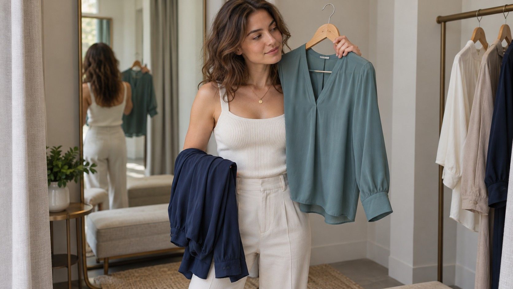
Compare a prospective coat over the tops you expect to wear with it. A large collar places more of the coat color close to your face than a low open neckline does. A scarf can change that relationship, but consider whether you want to depend on one every time. The practical choice may be the neutral that works with four existing tops, even if another looks slightly better in a standalone drape.
Do not assume black must disappear from your wardrobe because you are exploring a soft season. If a black neckline feels stronger than you want, try opening it over a softer top or adding a muted scarf. You can keep trousers, shoes, and bags that do not sit beside your face. Test a small adjustment before treating a seasonal palette as a replacement shopping list.
Check what hair, makeup, and lighting are changing
Dyed hair can affect the overall impression around the face. A warm copper color creates a different frame from an ashy brown, regardless of what an old quiz said. If the aim is to assess natural coloring, keep the dye in mind and compare without assuming it proves an undertone. If the aim is to get dressed today, include the hair color you actually wear. Those are both reasonable aims, but they answer different questions.
For the first fabric comparison, remove strong makeup if you can assess comfortably without it. Bronzer, a warm blush, or a cool lipstick can pull the combination toward a particular look. Later, repeat with your usual makeup. You may discover that a warmer top works especially well with one lipstick, while a cooler knit feels effortless with your everyday face. That is actionable information even when it does not simplify the seasonal label.
Use steady indirect daylight and avoid mixing a warm lamp with window light. A phone can alter white balance when the cloth changes, so compare in a mirror as well as taking photographs. Keep camera settings and framing consistent where possible. If a neutral object in the background changes color between shots, the images are not a dependable basis for judging subtle warmth differences. Retake them instead of debating the result.
Build a shared wardrobe while deciding
For the Soft Summer vs Soft Autumn border, start with items you repeatedly like rather than an entire downloaded palette. A medium muted blue-green, a gentle rose, or a taupe might provide useful common ground, depending on the actual shades. Check each beside your face and against your existing clothes. There is no universal overlap list that guarantees every garment will work, because softness, depth, and warmth vary within each color name.
Choose one neutral you already trust and two accent colors that make several outfits. For example, a familiar taupe jacket can serve as the fixed piece while you test rose and green tops. Photograph the combinations in the same light and note what felt easy. If a new purchase only works with imaginary future items, its seasonal label offers little practical value. Favor the version you can wear now.
Shopping online makes small differences harder to judge. Product lighting, screen settings, and editing can shift a muted shade substantially. Look at several photographs, including close views and a full outfit, and check the return conditions. At home, put the item beside a known favorite in the same room. A palette screenshot is useful for a broad direction; it is a weak authority over the actual cloth.
After several comparisons, you may see a consistent cooler or warmer preference. Use that to narrow future choices without demanding that every item agree. You may also find that softness matters more than warmth, leaving you comfortable across both groups. In the soft autumn vs soft summer question, that is a workable answer. A repeatable set of colors you enjoy wearing is more valuable than a confident label built from uncertain photographs.